Back to Work
02 — Glyph Tunc
Clock App Glyph Tunc
A sacred-geometry iOS clock where each glyph functions as both art and instrument — hidden features revealed through intuitive exploration.
A sacred-geometry iOS clock where each glyph functions as both art and instrument — hidden features revealed through intuitive exploration.
3
Clock faces · Analog, Stopwatch, Timer
0
Labels · every control is a glyph
iOS
Native platform
Solo
Concept, design, prototype
Glyph Tunc is a sacred-geometry iOS clock where each face functions simultaneously as art and interactive instrument. Hidden features surface through exploration rather than menus or labels.
Tunc began as a single question: what if telling time felt like reading a symbol rather than scanning a label? Most clock apps treat the interface as a container for data — numbers arrayed on a neutral field, buttons stacked in rows. Tunc inverted that assumption. The geometry is the data. The glyph is the clock.
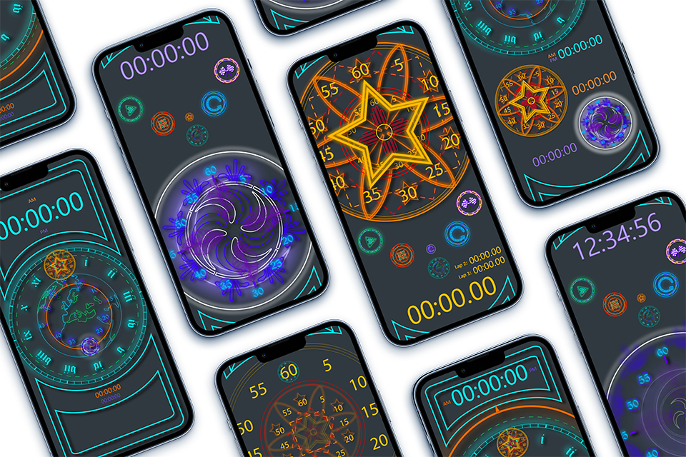
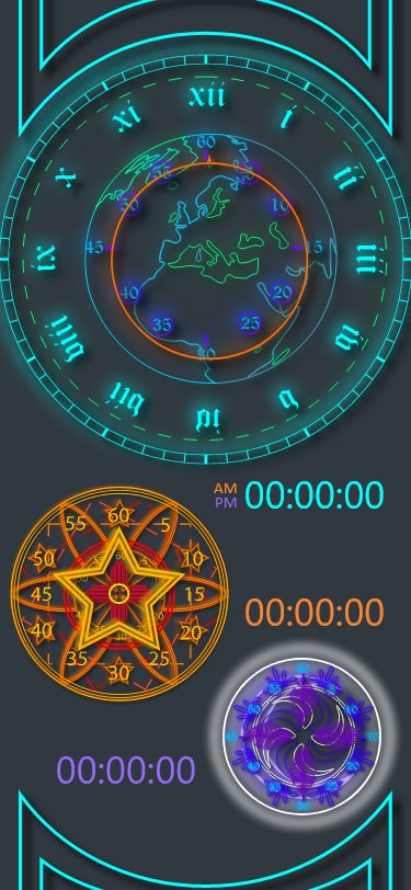
The result is three distinct faces — a World Analog, a Star Stopwatch, and a Spiral Timer — each sharing a visual grammar of concentric rings, runic Roman numerals, and neon-on-dark color. Every control is itself a glyph. Nothing is labeled. Everything operates.
Glyph Tunc first stands as a work of art with a practical purpose, in this case, a transformable clock. First figure out how it works, and you may find hidden features that expands the tool use. Each new version will bring new features, fixes, and repairs, evolving over time.
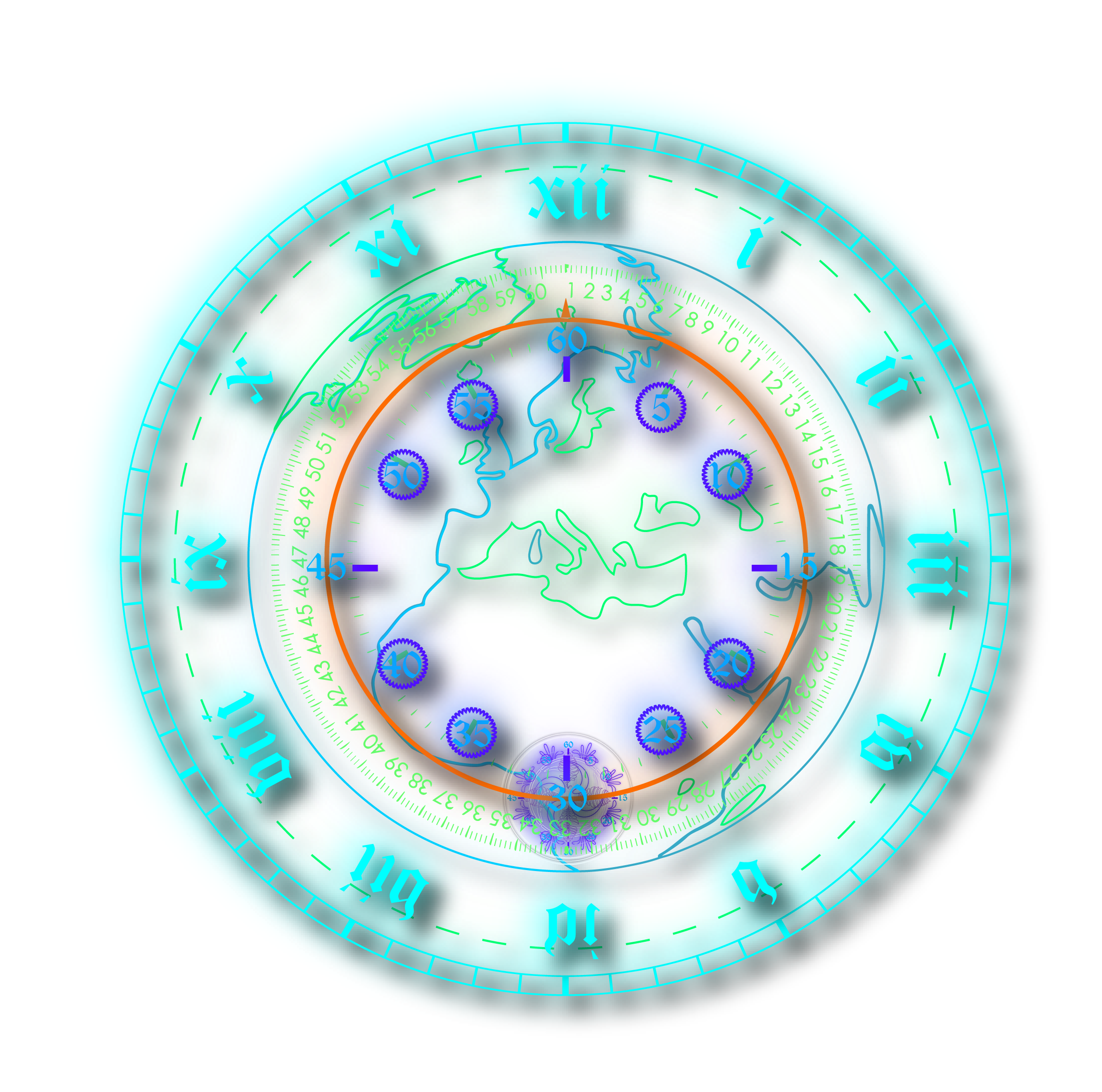
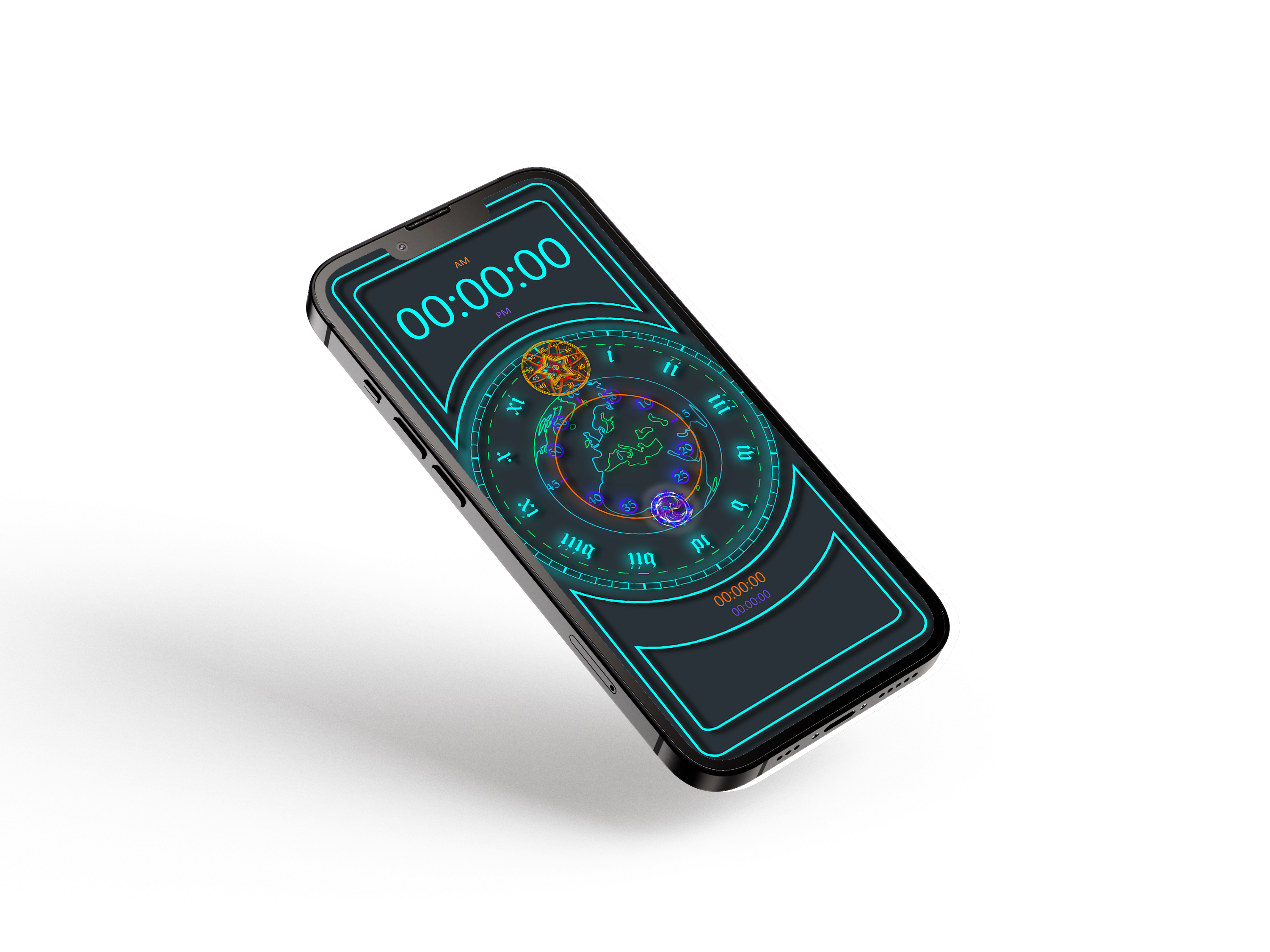
The World Analog — concentric rings of Roman numerals, seconds, and world map glyph
Conventional clock apps optimize for speed of reading — the time value extracted in under a second, the app closed. That's efficient. It's also a design ceiling. An app that rewards only glancing trains you to glance. Tunc proposed a different contract: an interface worth looking at long enough to discover what it could do.
The design problem wasn't making a clock more functional. It was making a clock worth dwelling in — where every additional second you spent looking revealed something the previous second didn't. That meant the UI had to earn curiosity, not instruct it.
Each mode — Analog, Stopwatch, Timer — shares a concentric-ring structure and neon-on-dark palette while expressing its own glyph identity.
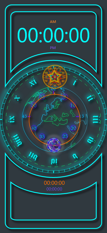 Face 01 — World Analog
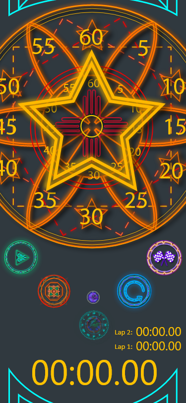 Face 02 — Star Stopwatch
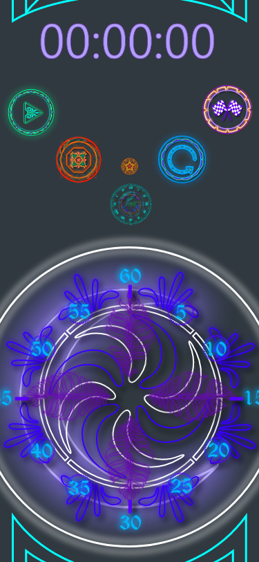 Face 03 — Spiral Timer
Solo end-to-end: from glyph vocabulary to release. Every decision was a design decision — the code, the color, the control model.
Developing the glyph vocabulary — what symbols carry aesthetic weight and functional clarity simultaneously? Mapping time states to geometric forms: rings for hours, concentric density for seconds, rotational arc for elapsed.
Establishing the design grammar that holds across all three faces: consistent ring architecture, consistent color semantics (teal for time, gold for stopwatch, violet for timer), consistent glyph treatment for every interactive element.
Implementing the full UI in Unity for iOS — real-time glyph animation, tap and gesture interaction, and the hidden control model. Testing whether affordances were discoverable without being labeled.
Post-launch iteration. Refining animation timing and glyph legibility based on real-device testing across screen sizes. Each revision tightened the calibration between visual weight and tap confidence.
Every button, ring, and color value was specified — ensuring the glyph system held together as a coherent visual language across all three faces.
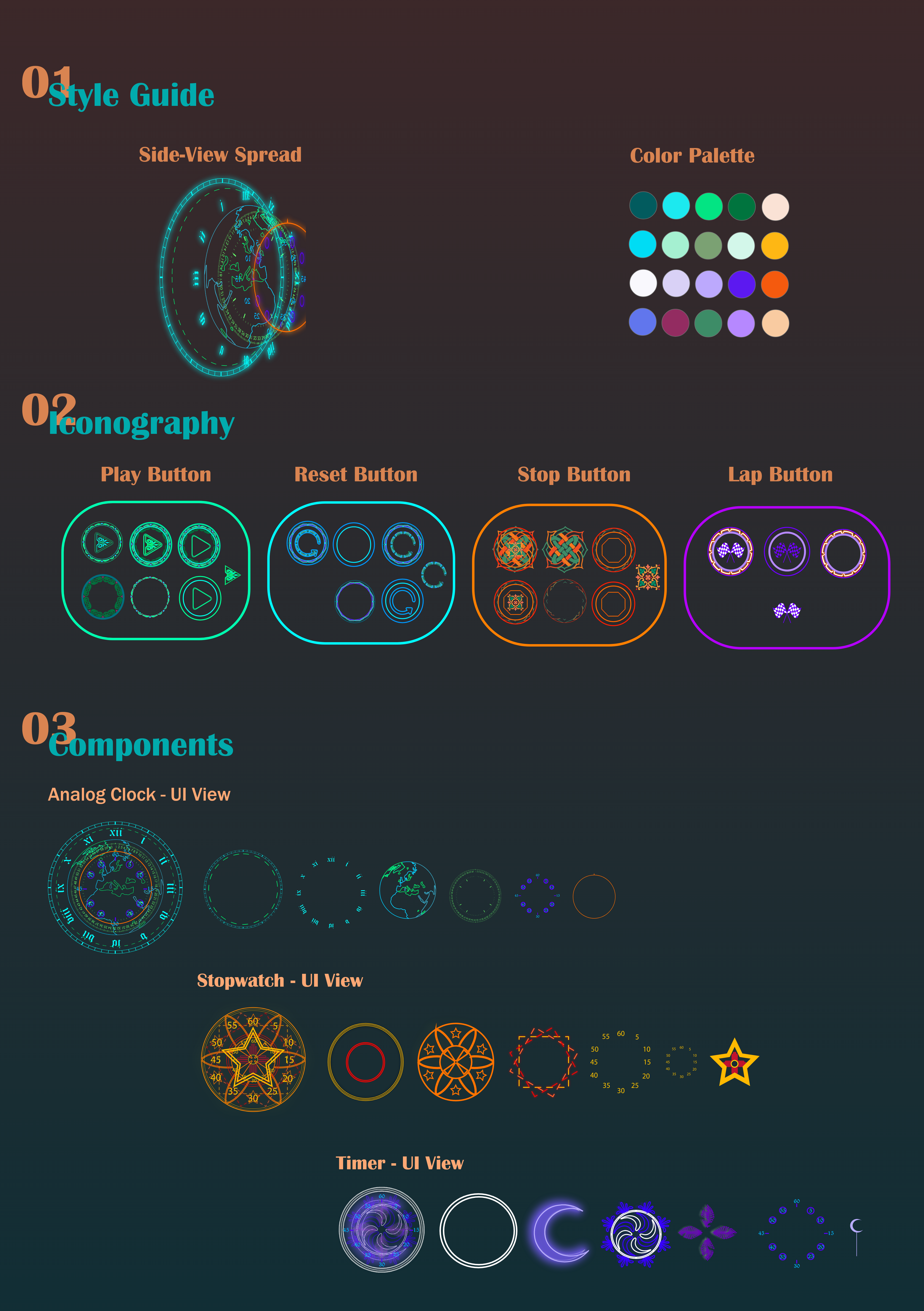
Color palette · Button iconography (Play, Reset, Stop, Lap) · Component UI states across all three faces
"A clock face that makes you look twice — and rewards you when you do."
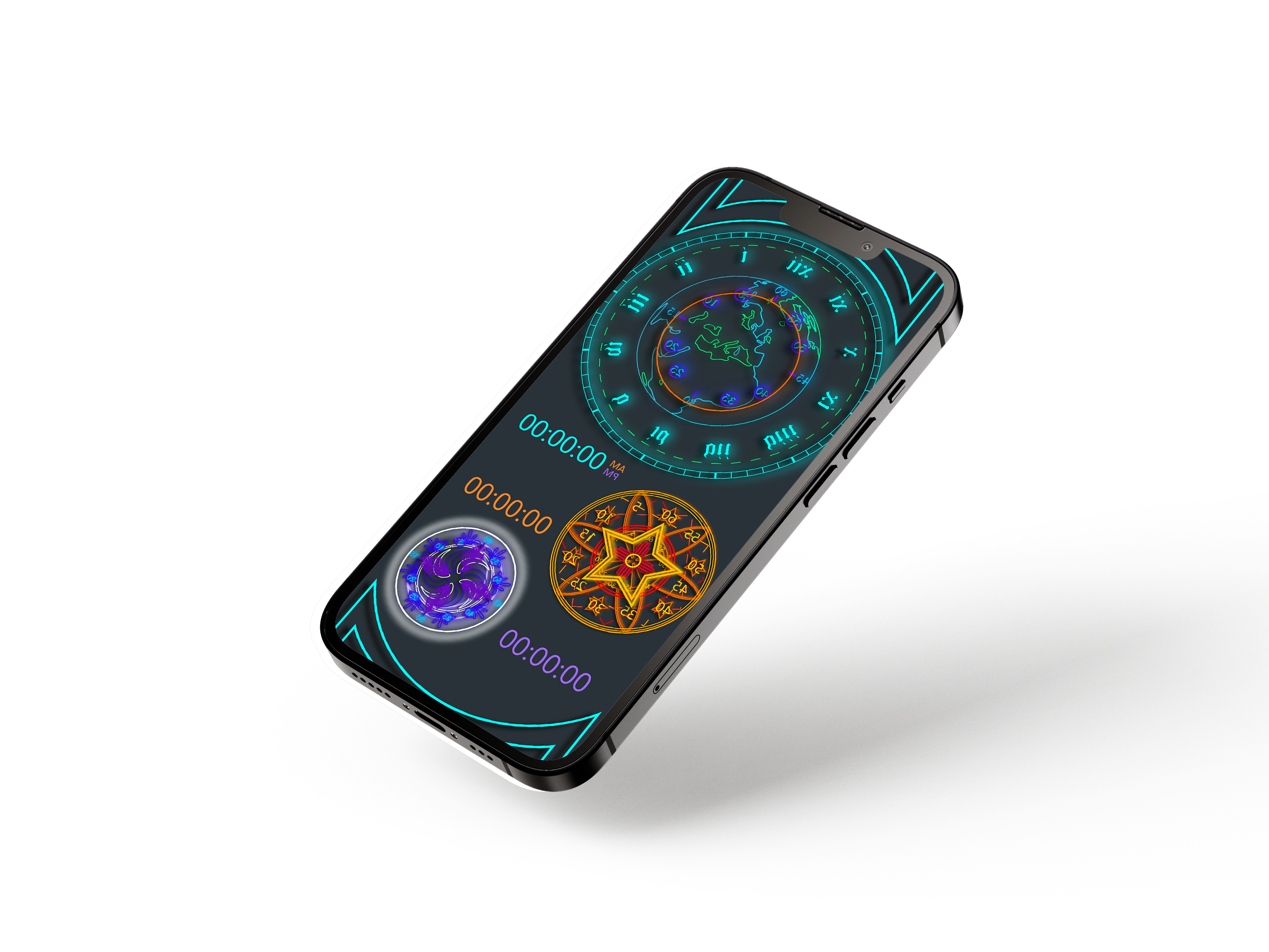
Every element in the UI is functional. The concentric rings aren't decoration — they carry hours, minutes, and seconds. The star form of the stopwatch tracks elapsed lap segments. The spiral glyph of the timer encodes countdown state in its rotation. Nothing purely decorates; everything operates.
Controls surface through interaction rather than chrome. The glyph ring above each face holds Play, Reset, Stop, and Lap as circular glyphs — their function discovered by tapping, not read from a label. This was the hardest design problem: making the hidden findable without making it obvious. The answer was visual weight — glyph icons that clearly respond to touch, even when their specific function isn't yet known.
Each face owns a color identity — teal for the World Analog, gold-orange for the Star Stopwatch, violet for the Spiral Timer. This isn't decorative variety; it's a navigation system. The color tells you where you are before you read anything. Within each face, tighter color rules govern state: active vs. idle, elapsed vs. remaining.
The hardest tension in Tunc was calibrating how hidden the hidden features should be. Too discoverable and the app feels like every other clock with a skin on it. Too obscure and first-time users quit before the interface opens up. I landed somewhere in the middle — which means some users never found everything — and I'd push harder on that calibration now. More deliberate onboarding that teaches the grammar without breaking the mystique.
The deeper lesson carries forward into everything I design: when the interface itself is the reward, users will spend time with it. You don't need to explain what a beautiful thing does — you need to make the explanation feel like discovery. That principle shows up in every system I've built since, including Calcu and the later AI-facing work where the same instinct applies: make the surface worth dwelling in.
Always open to conversations about AI experience, product strategy, XR, or art.
Get in Touch cperry079@outlook.com