Back to Work
03 — Glyph Calcu
Calculator App Glyph Calcu
A creative calculator UI designed, developed, and prototyped entirely in Unity — geometric art direction applied to a utility no one expected to feel beautiful.
A creative calculator UI designed, developed, and prototyped entirely in Unity — geometric art direction applied to a utility no one expected to feel beautiful.
3
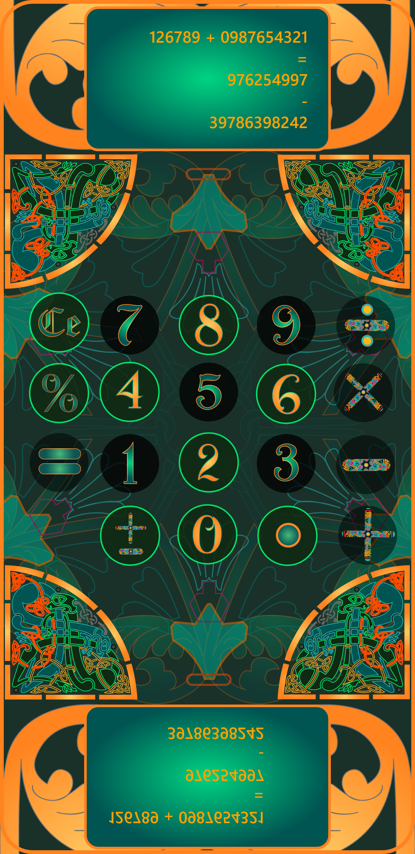
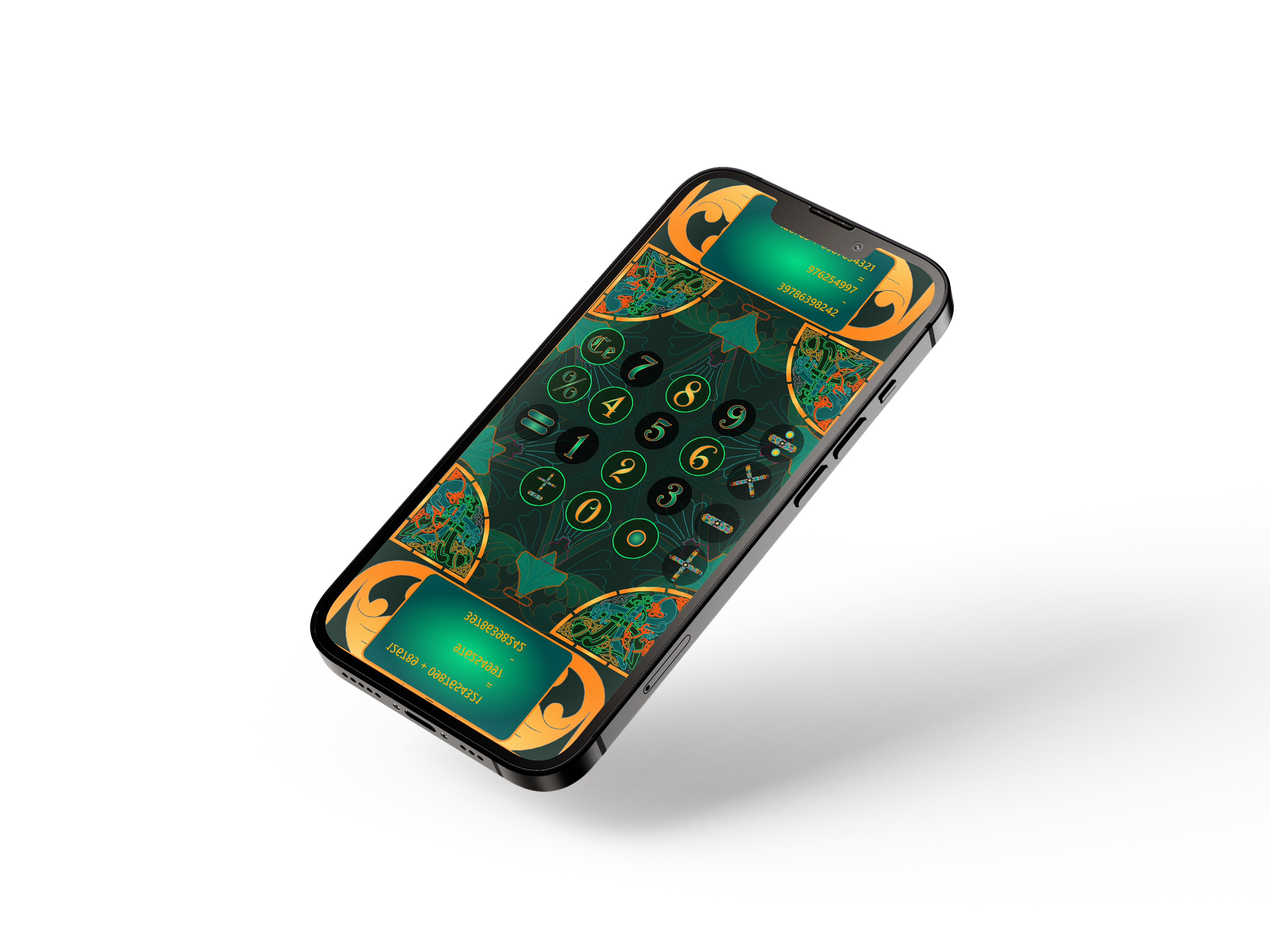
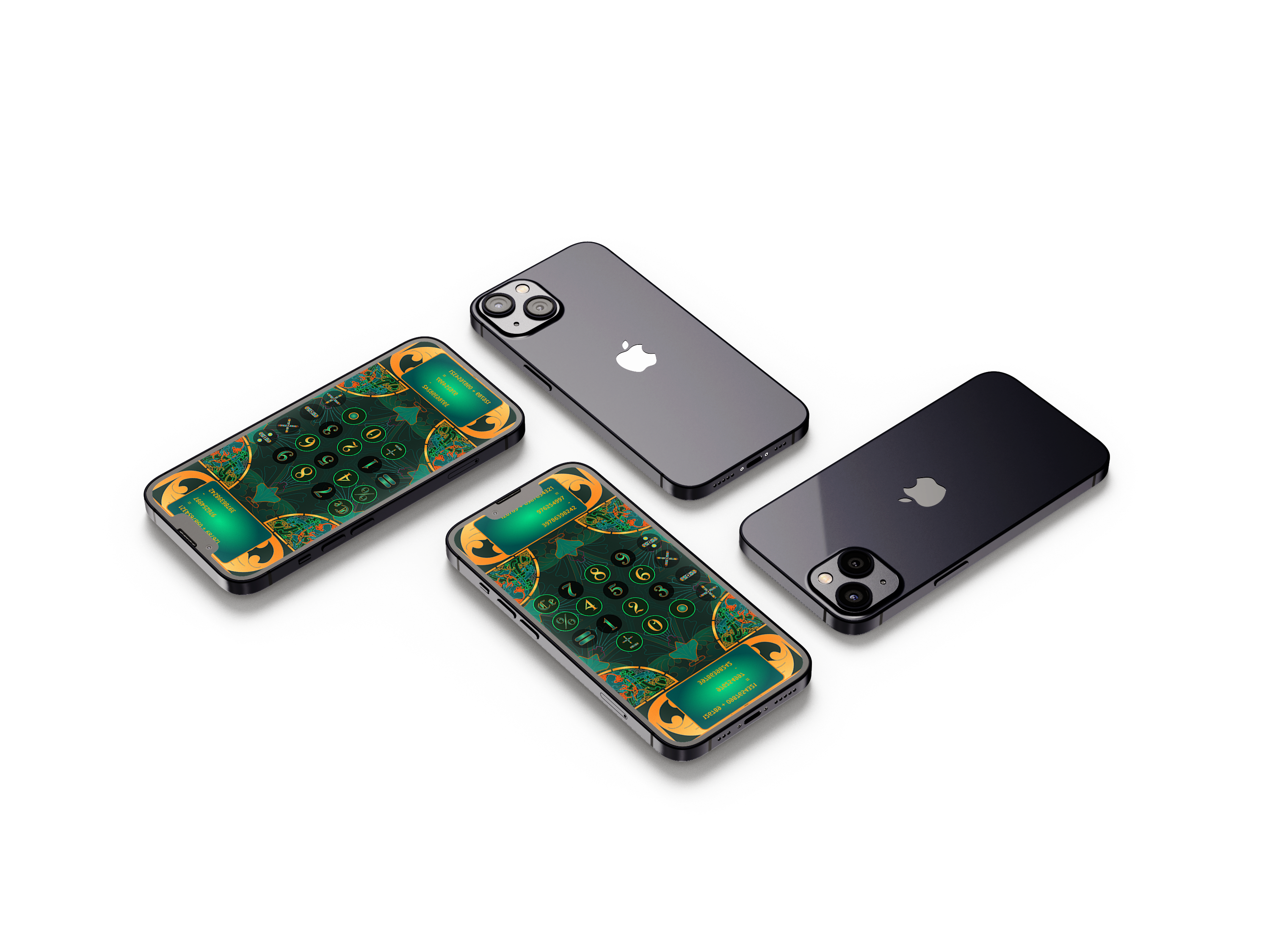
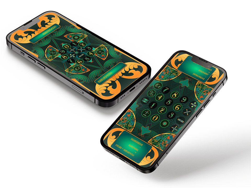
Layout modes · grid, cross, mandala
Unity
Built natively in C# · not prototyped
Every key
A custom glyph in a unified visual language
Solo
Concept, design, code
Glyph Calcu is a creative calculator interface designed and prototyped entirely in Unity. The challenge: apply geometric art direction to a tool everyone uses but no one looks at.
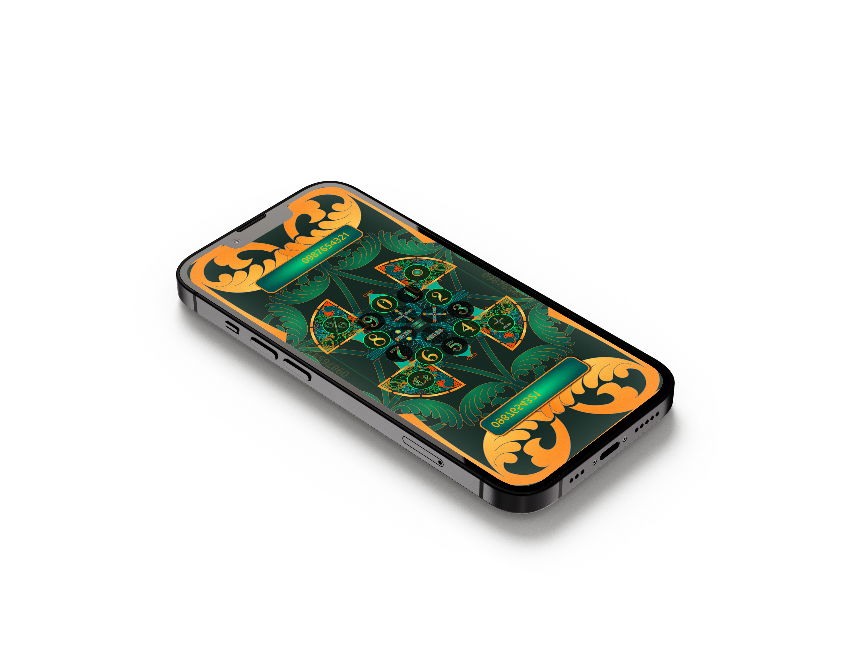
Glyph Calcu began as a single question: could the most utilitarian interface on a smartphone be made to feel like a found artifact? The calculator — a tool everyone uses and no one considers — became the canvas. Not to confuse, but to reward. Three distinct layout modes emerged from the exploration: a standard 4×4 grid for familiarity, a cross/compass arrangement for ergonomic reach, and a circular mandala where every key sits equidistant from your thumb. The system is a fully realized visual language — every digit and operator redrawn as an ornamental glyph that still reads instantly.
Unity was chosen over Figma not as a workaround but as a deliberate decision. Figma is for layouts. Unity is for experiences. The choice meant writing C# alongside design logic, but it unlocked something no prototype tool could offer: real math running behind real motion, live on device. The app calculates. The interface performs. Both happen at the same time, in the same build.
Glyph Calcu first stands as a work of art with a practical purpose, in this case a calculator. First figure out how it works, and you may find hidden features that expands the tool use. Each new version will bring new features, evolving over time.
Three distinct interface modes — standard grid, circular mandala, and cross/compass layout
Calculators are invisible by design. Every touchpoint is optimized to disappear — flat buttons, monospace digits, a display that clears the moment you look away. The calculator is the only app people use daily and never question. Its entire aesthetic history is: get out of the way. What no one challenged was whether invisible had to mean forgettable.
The reframe wasn't "make a prettier calculator." It was "make a calculator that earns a second look." The constraint was strict — every number and operator had to remain immediately legible, regardless of how ornamental the surface became. The opportunity was everything else: color, form, layout, motion, and the relationship between a digit and the mythology it could carry.
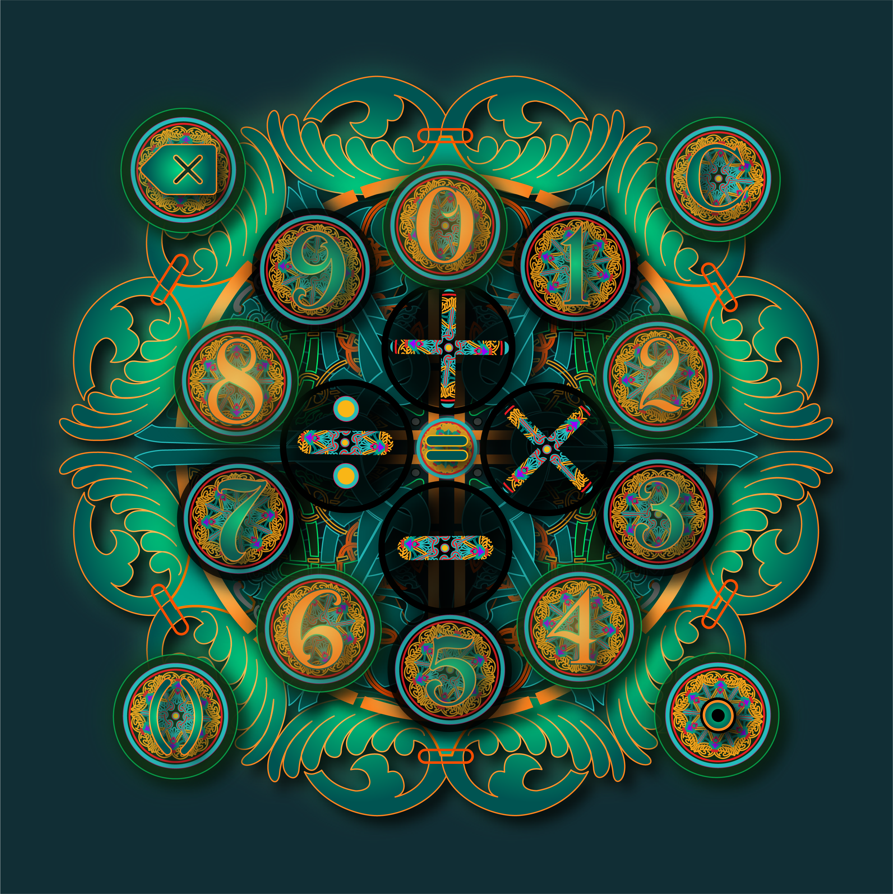
The circular mandala mode — digits 0–9 radially arranged, operators at center. Every key equidistant from the thumb.
The process moved in three phases — glyph system first, layout modes second, Unity integration third. The mandala mode wasn't planned. It emerged from the grid study when a circular arrangement of 0–9 turned out to be more spatially intuitive than expected.
Each digit (0–9) and operator (+, −, ×, ÷, =, %, ←) was redrawn as an ornamental glyph — part of a fictional visual language built on the Orbitron typeface, enriched with baroque flourishes. Each symbol unique, all sharing a grammar of curves, weight, and enclosure.
Three layout modes surfaced from grid exploration: the familiar 4×4 for muscle memory, a cross/compass for single-thumb reach, and the radial mandala where 0–9 orbit the four operators like a compass rose. Each mode uses the same glyph set — only the spatial grammar changes.
Each mode was wired to live C# math logic from day one. Mode transitions use shader-driven morphing — keys don't snap to new positions, they flow. The result isn't simulated; it calculates, animates, and responds exactly as the final app would.
Glow on press, ambient idle animation on the display, haptic distinction between digits and operators. Every detail tested against one rule: does this serve the math, or does it compete with it? Anything that competed was cut.
A full visual system — palette, iconography, typography, and UI components — defined before a single line of Unity code was written.
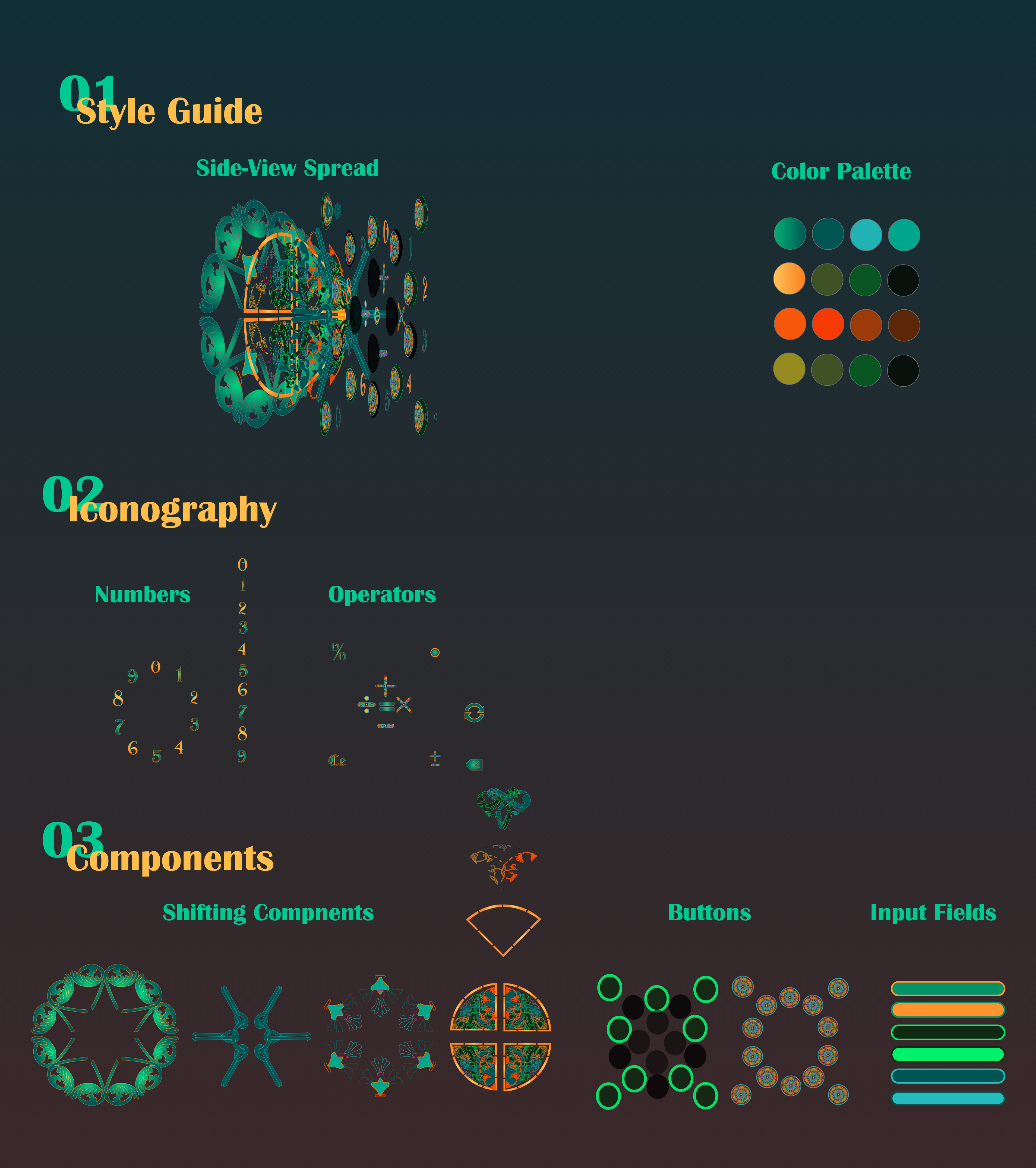
Style guide: deep emerald + amber palette · Orbitron-based glyph system · shifting button components · pill-shaped input fields
"Every calculator tells you what to do. Glyph Calcu asks you to look first."
The ornamental digits were designed as a tight visual system — each one unique, but all sharing a grammar of curves, enclosure shapes, and stroke weights derived from the Orbitron typeface. Legibility was preserved by keeping proportional conventions standard; only the surface language changed. In testing, recognition at 44pt was instant. The glyphs read as digits. They just didn't look like every other digit you've ever seen.
The mandala mode couldn't have existed in Figma. Its layout is radial, its transitions are geometric, and its math is live. Unity let design and logic breathe in the same environment from the first session. That early coupling — shape and function sharing the same codebase — surfaced interaction patterns that a static prototype would have hidden for weeks.
The decorative surface is already loud. Motion had to stay quiet. Animation is reserved for exactly two moments: a brief radial pulse on key press, and a slow geometric morph on mode transition. Everything else is still. The rule that drove every cut: if the animation draws attention to itself rather than confirming an action, it doesn't belong here.
Building in Unity stretched the visual ambition and grounded it in reality simultaneously. The mandala mode exists because the engine made it natural to think spatially — to ask "what if the keys aren't in a grid at all?" and answer that question in an afternoon. The biggest lesson: constraint and craft aren't opposites. The strictest constraint in this project — every digit must remain readable — produced the most creative result. Ornament in service of function is different from ornament for its own sake, and that difference shows.
If I were rebuilding Calcu today, I'd push the glyph system further into the operators. The digits are fully realized — each one feels invented. The operator glyphs (+, −, ×, ÷) are functional but less mythologized. That's the unfinished chapter: an operator language as deep as the numeral language, so that pressing × feels as distinct as seeing a 7.
Always open to conversations about AI experience, product strategy, XR, or art.
Get in Touch cperry079@outlook.com