Back to Work 04 — HealthCheck

Disease Surveillance HealthCheck

Leading the UI/UX redesign that modernized Florida's statewide disease surveillance platform from a legacy .NET web application into a React MUI, glassmorphic design system — designed by me, built by the development team, and live during an active pandemic response.

Role
UI/UX Design Analyst
Timeline
2021 – 2022
Team
Solo Designer · Partnered with Developers
Tools
Figma · Adobe XD · Designed for React MUI
Project Type
Government Health Tech · Legacy .NET Modernization · Responsive Web App · Florida DOH

67

Counties served · Florida DOH

3

Deliverables · Whitepaper, Style Guide v3, redesigned screens

1

Designer leading the redesign

Mid-crisis

Redesigned during the COVID-19 pandemic response

01 — Overview

A pandemic hit a system built for another era.

Florida's epidemiologists were tracking COVID-19 across 67 counties through HealthCheck — a disease surveillance platform whose interface had barely changed since the Windows XP era. The redesign had to land mid-crisis.

When COVID-19 emerged in early 2020, the Florida Department of Health was managing a historic public health response on top of a system designed for paper-form-era data entry. Dense rows, horizontal scrolling, nested dialog boxes, and a flat information architecture had become operational liabilities. Every second of interface confusion translated directly into delays in case investigation, lab triage, and CRF routing — work that, during a pandemic, mattered.

I was brought in as UI/UX Design Analyst for the visual and interaction redesign of HealthCheck — the central case-management interface used by public-health investigators, epidemiologists, and administrators across the state. The deliverables were three: a UI Trends Whitepaper, Style Guide v3 (the glassmorphic edition), and the redesigned screens themselves.

The project followed the traditional path: research, design, handoff, then development. I owned the research and design, handed the style guide and screens to the development team, and they built the new UI in React MUI to replace the legacy .NET interface. As the build came together, I reviewed the developers' work against the designs to confirm that what went live matched what I had designed.

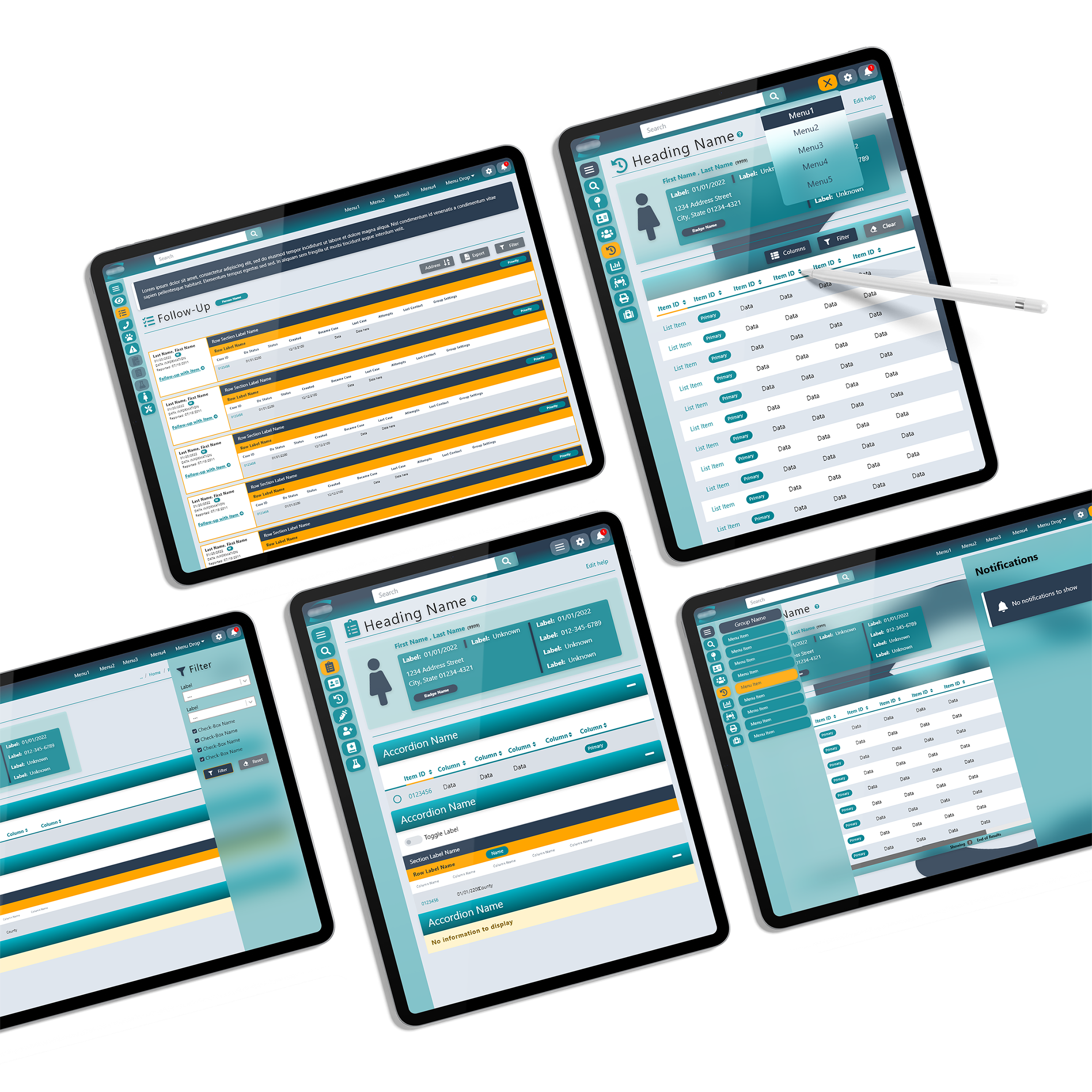
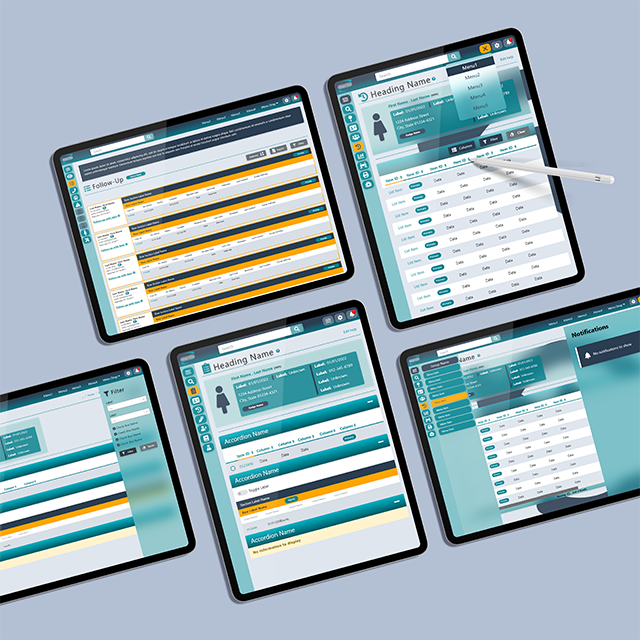
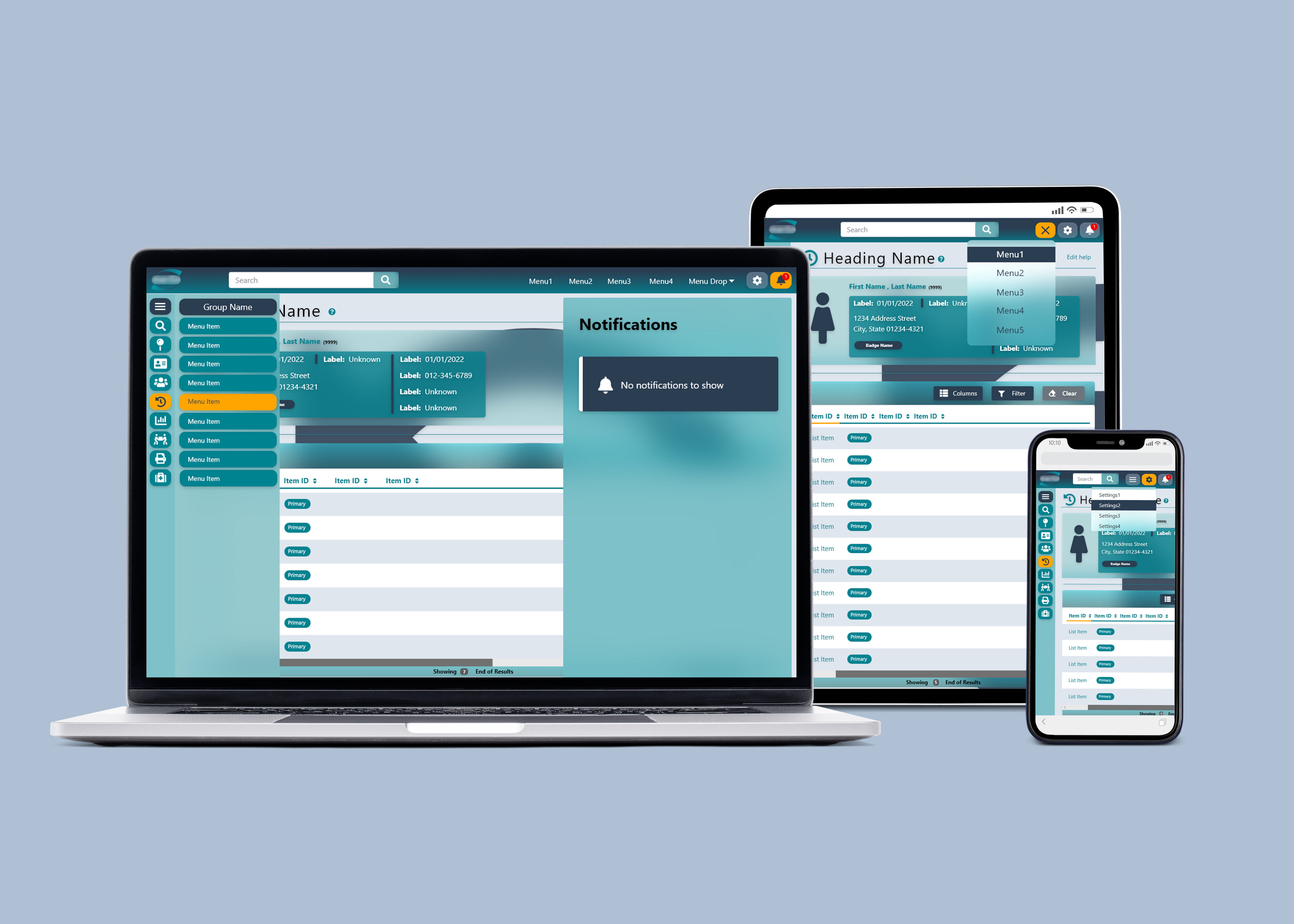
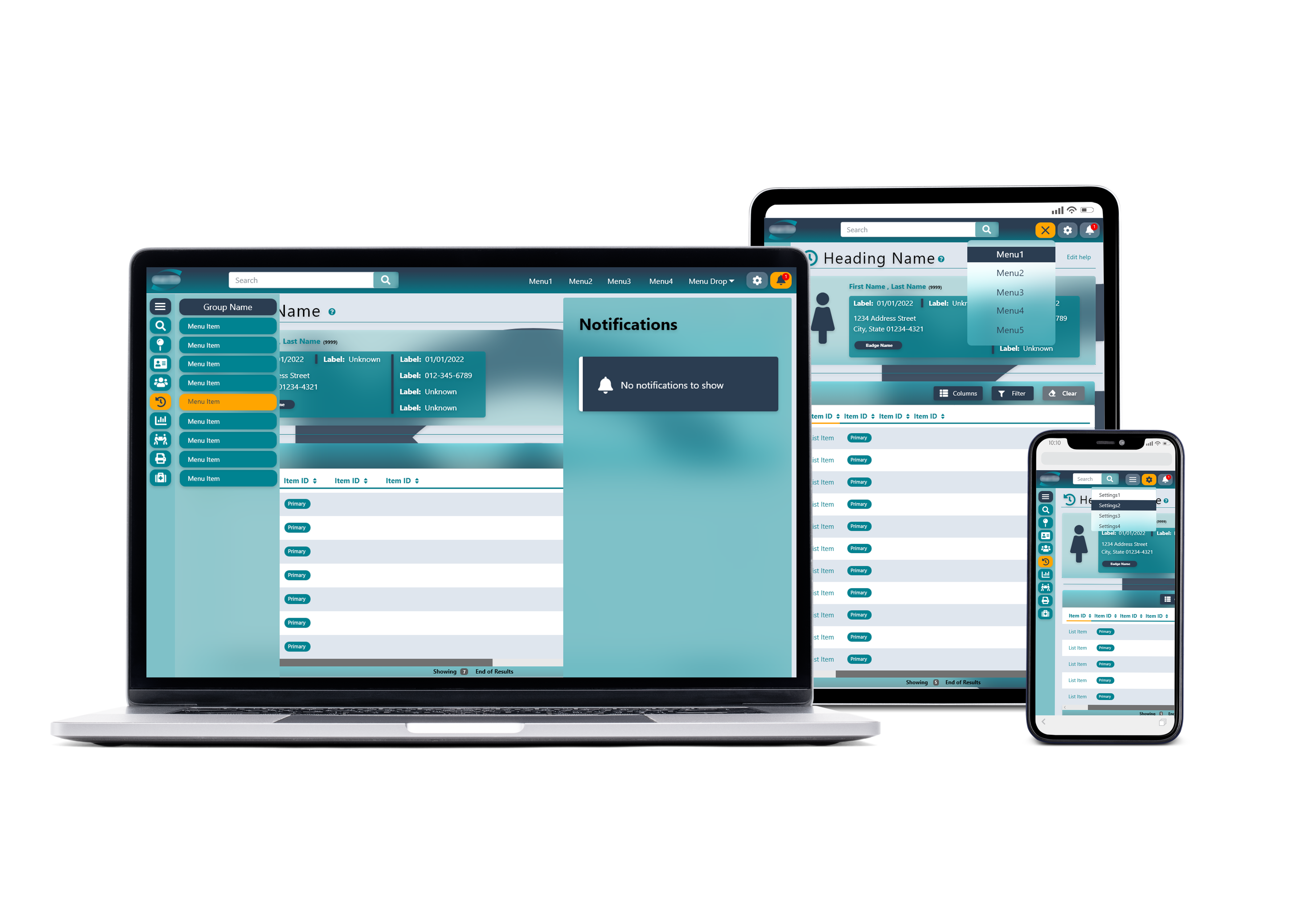
HealthCheck — multi-device showcase across desktop monitors and tablet
HealthCheck deployed across desktop, laptop, and tablet — one responsive system serving statewide and field investigators
02 — The Problem

What was actually broken.

The legacy HealthCheck interface, a .NET web application, reflected its origins: a form-driven desktop application ported to the web without UX reconsideration. Twelve to eighteen columns competed for attention in every table, critical status fields lived off-screen under horizontal scroll, and the site's forty-plus destination screens had grown organically over two decades with no consistent breadcrumb pattern. Field epidemiologists conducting site visits had zero mobile access — the entire system assumed a desktop, in an office, during business hours.

Insight
The interface wasn't decoration. In disease surveillance, the wrong visual hierarchy can delay a case investigation by minutes — and during a pandemic, minutes are infrastructure.

The reframe wasn't "make it prettier." It was: rebuild the cognitive surface so an investigator could triage 100+ cases without breaking concentration, route work between teams without leaving the screen, and act on a case from a phone at a site visit. Glassmorphism wasn't the goal — it was the visual language that made depth, layering, and progressive disclosure read at a glance.

HealthCheck — glassmorphic navigation with full case search and outbreak panels
The redesigned navigation shell — fixed icon rail, breadcrumb trail, glassmorphic content layers, and live status pills replacing two decades of menu paths.
03 — Process

How it got built.

The traditional path: research, design, handoff, then development. Each phase produced a deliverable the next phase depended on — the whitepaper justified the style guide, the style guide justified every individual screen, and the screens became the developers' blueprint.

Step 01
Research

Authored the UI Trends Whitepaper (2021) — a structured audit of the legacy interface, competitive analysis of modern healthcare dashboards, and a documented set of design principles. Every later decision had an evidential foundation to point at.

Step 02
System

Built Style Guide v3 — colors, typography scale, components, alert patterns, and the glassmorphic layering rules. Locked the system before any individual screen was designed so the work would not fragment across contributors and 40+ destinations.

Step 03
Screens

Redesigned the Epi Task Set, search results, outbreak management, patient profile, and resource library screens from one component grammar, then extended the system to tablet and mobile. For the first time in HealthCheck's history, field epidemiologists could log site-visit findings and create outbreak records in real time — a workflow that previously didn't exist.

Step 04
Handoff & Build Review

Handed the style guide and screens to the development team, who built the new UI in React MUI. I reviewed their builds against the designs on web, tablet, and mobile to confirm that what went live matched the design intent.

HealthCheck — resource search results with column controls
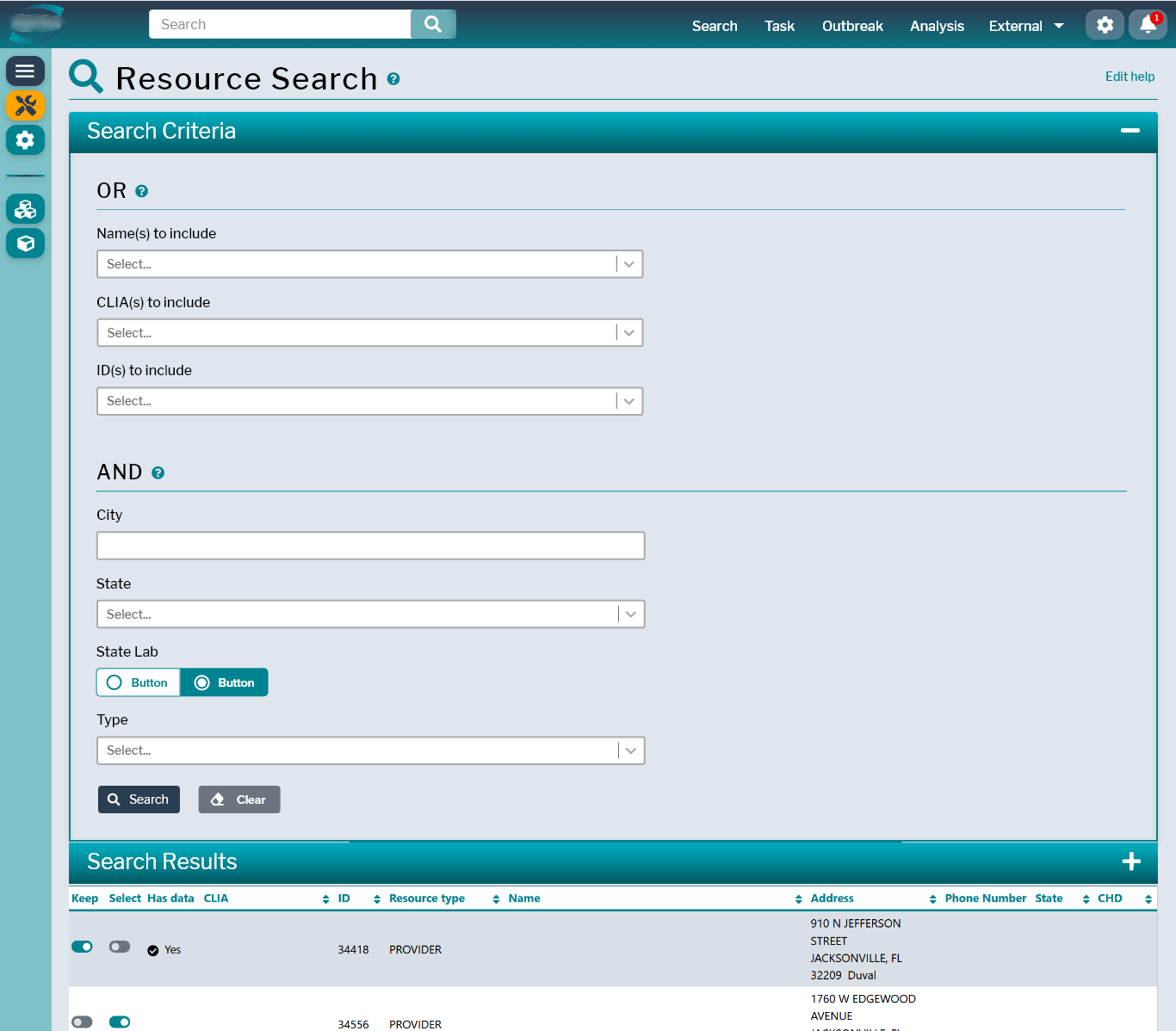
Resource search — column visibility, density modes, and one-click export replaced multi-step IT workflows
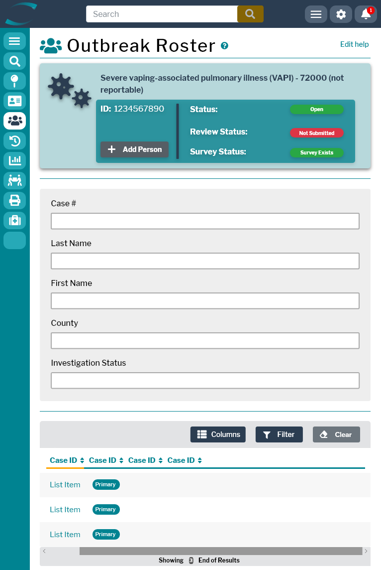
HealthCheck — outbreak roster glassmorphic data grid
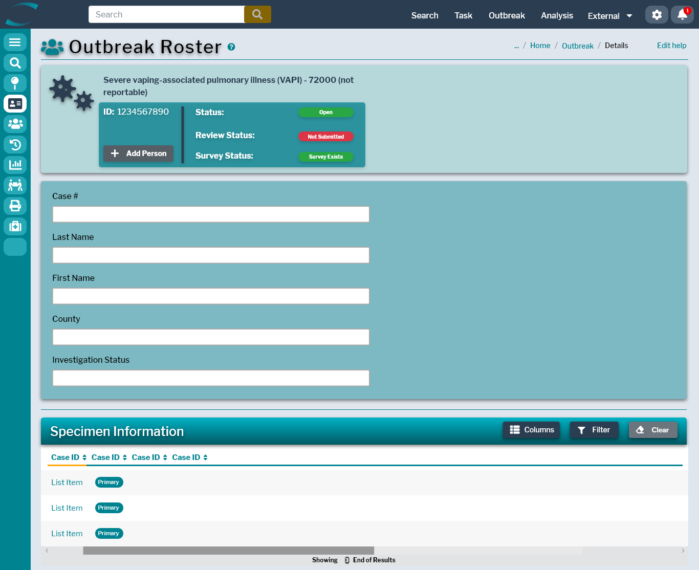
Outbreak roster — tab-based task routing with live count badges, semantic status pills, zero horizontal scroll
"In disease surveillance, the wrong visual hierarchy can delay a case by minutes. Minutes are public-health infrastructure."

67

Florida counties · statewide reach

40+

Destination screens redesigned

3

Form factors · web, tablet, and mobile

This wasn't a redesign for a future roadmap. It went live while the outbreak was happening.

04 — Design System

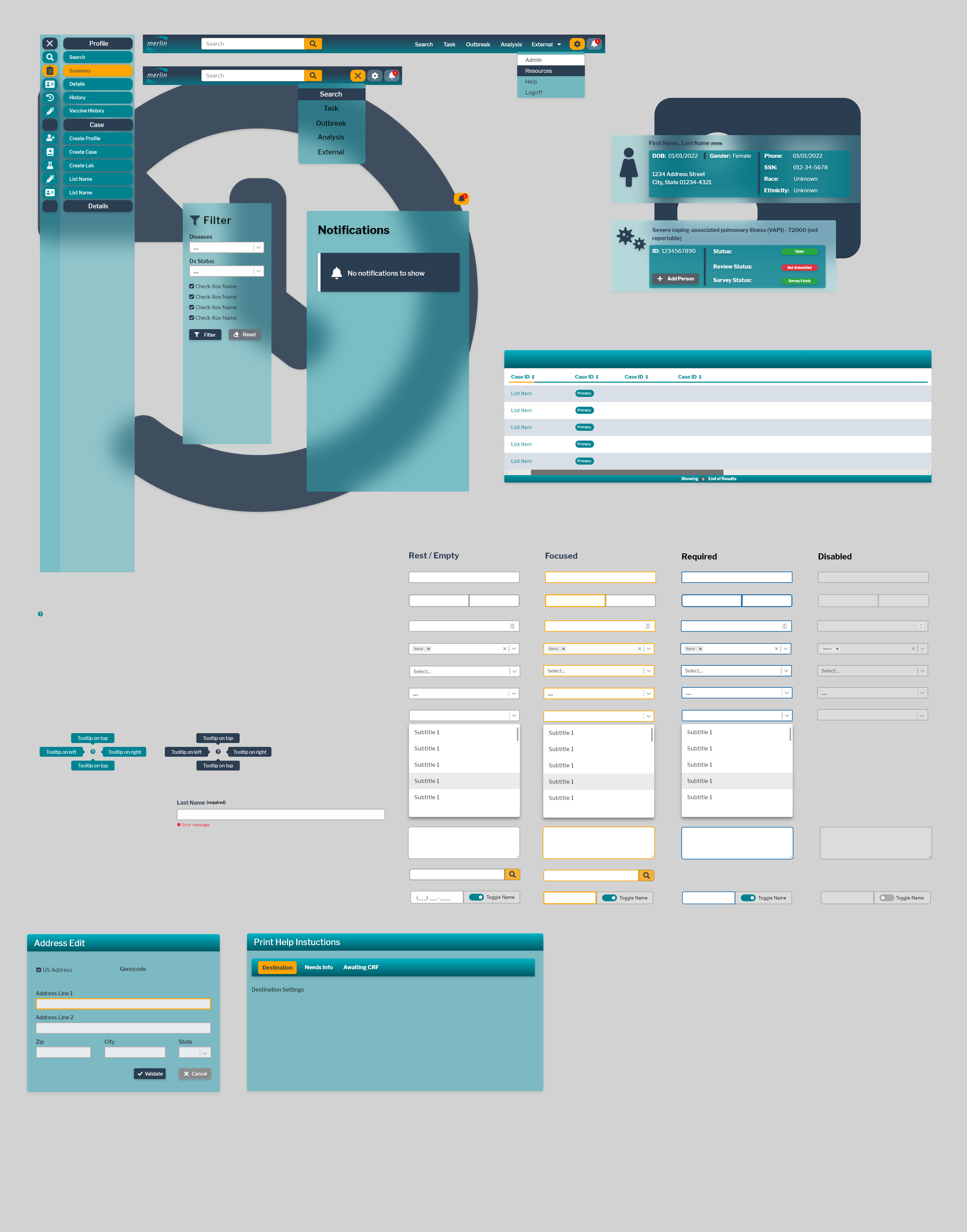
Style Guide v3 — glassmorphic edition.

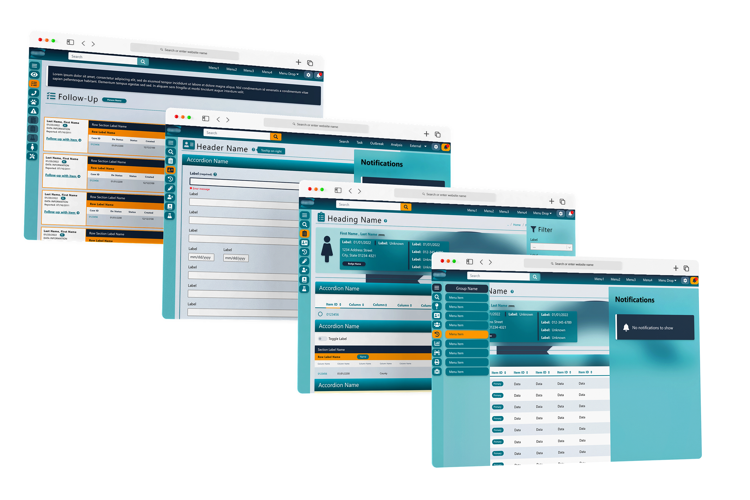
A full visual language defined before any screen was finalized: a teal-led palette tuned for status legibility, a Libre Franklin type scale, an alert system, and a glassmorphic layering pattern that became HealthCheck's signature.

HealthCheck — patient profile summary in glassmorphic style with layered cards
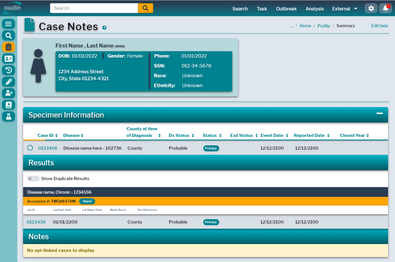
Patient profile summary — layered glassmorphic cards reveal progressively sensitive data, building a natural access-control hierarchy directly into the visual design.
05 — Key Decisions

The choices that mattered.

Glassmorphism as the North Star

After surveying 2021 UI trends in enterprise healthcare software, glassmorphism emerged as the optimal direction. The reason wasn't aesthetic — it was functional. Layered translucent surfaces let me separate reference data from actionable data, foreground from background, and primary records from extended demographics, all without adding panels or modals. Depth became the organizing principle.

Dual-Rail Navigation

Replaced a horizontal menu bar of nested dropdowns with a persistent vertical icon rail plus a contextual breadcrumb trail in system orange. Investigators always knew exactly where they were in the application hierarchy — and could reach any major destination in a single click without losing their current case context.

Tab-Based Task Routing

The Epi Task Set became the workspace's center of gravity. Live count badges on tabs — "Ready for Review 100+", "Needs Info 10", "Awaiting CRF 1" — let epidemiologists see queue depth before clicking. Daily prioritization decisions moved from gut feeling to glance.

Data Grid Control Bar

Introduced a professional grid toolbar — COLUMNS · FILTERS · DENSITY · EXPORT — that fundamentally shifted the power dynamic between users and the interface. Investigators could customize what they saw without IT support; three density modes (Compact / Standard / Comfortable) matched the same screen to different workflows.

Design Principle

Every major interface decision was made to reduce cognitive load during crisis — not to look modern. The glassmorphism, the dual rail, the tab routing: all of it was in service of a user who couldn't afford to think about the UI.

Responsive First — Especially Mobile

The mobile design was built dark-first. Navy backgrounds reduced eye strain during evening site visits, conserved OLED battery, and informed the desktop glassmorphism palette in return.
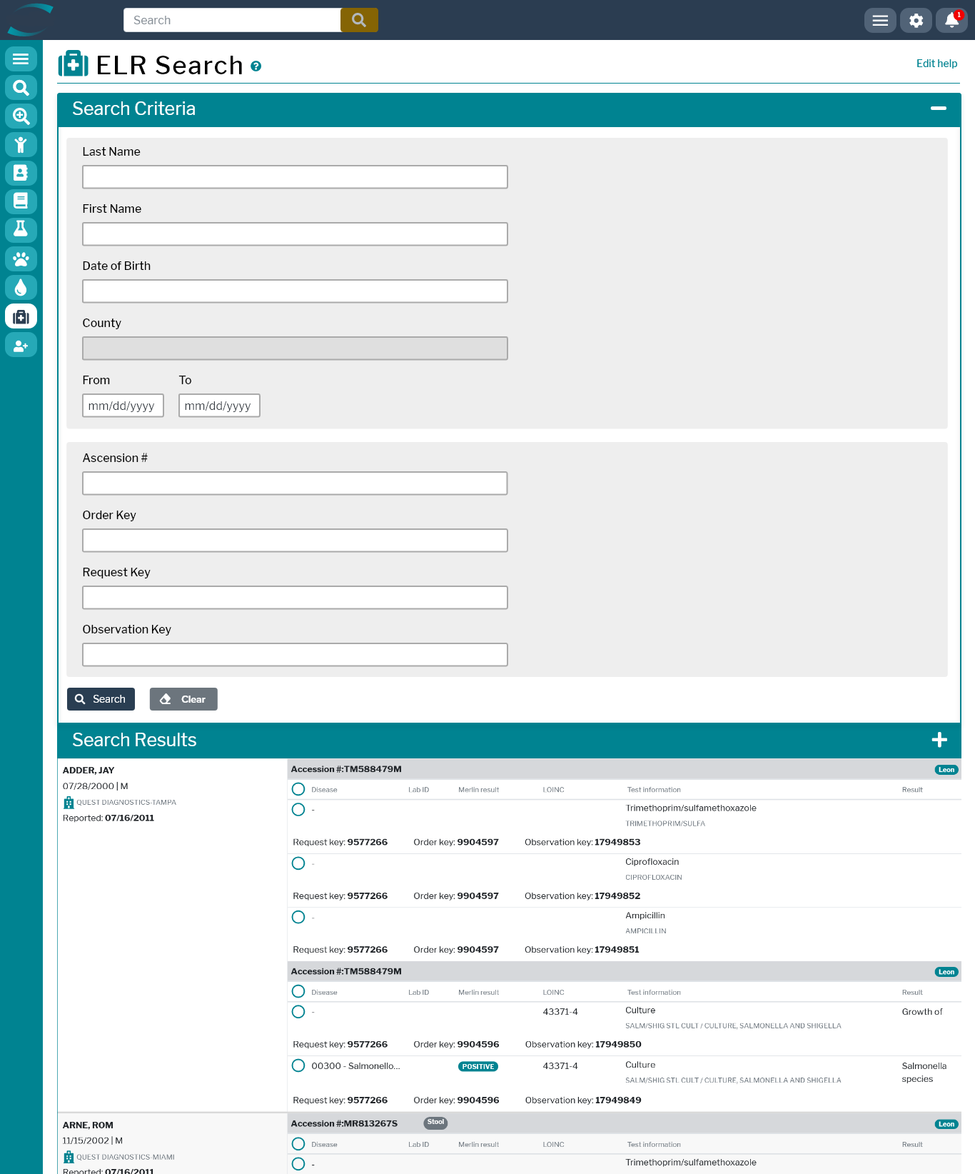
HealthCheck — ELR lab result search on web HealthCheck — admin interface on tablet
Electronic Lab Result triage on web · the same system on tablet for field investigators — one responsive grammar, two contexts.
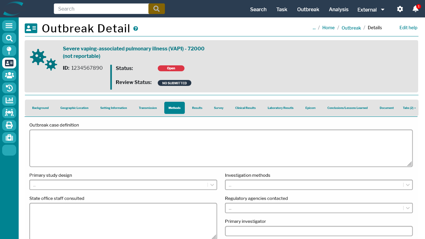
HealthCheck — outbreak detail with statistics and roster
Outbreak detail — statistics, roster, and follow-up coordination on a single canvas
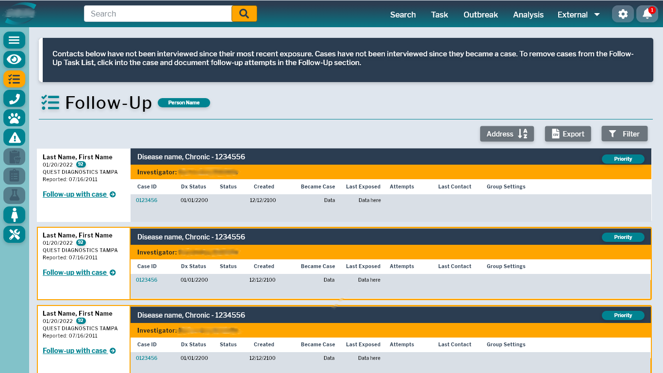
HealthCheck — outbreak follow-up management screen
Outbreak follow-up — investigator assignment and status tracking in the same visual grammar
06 — Glassmorphic Profiles

Layered patient information.

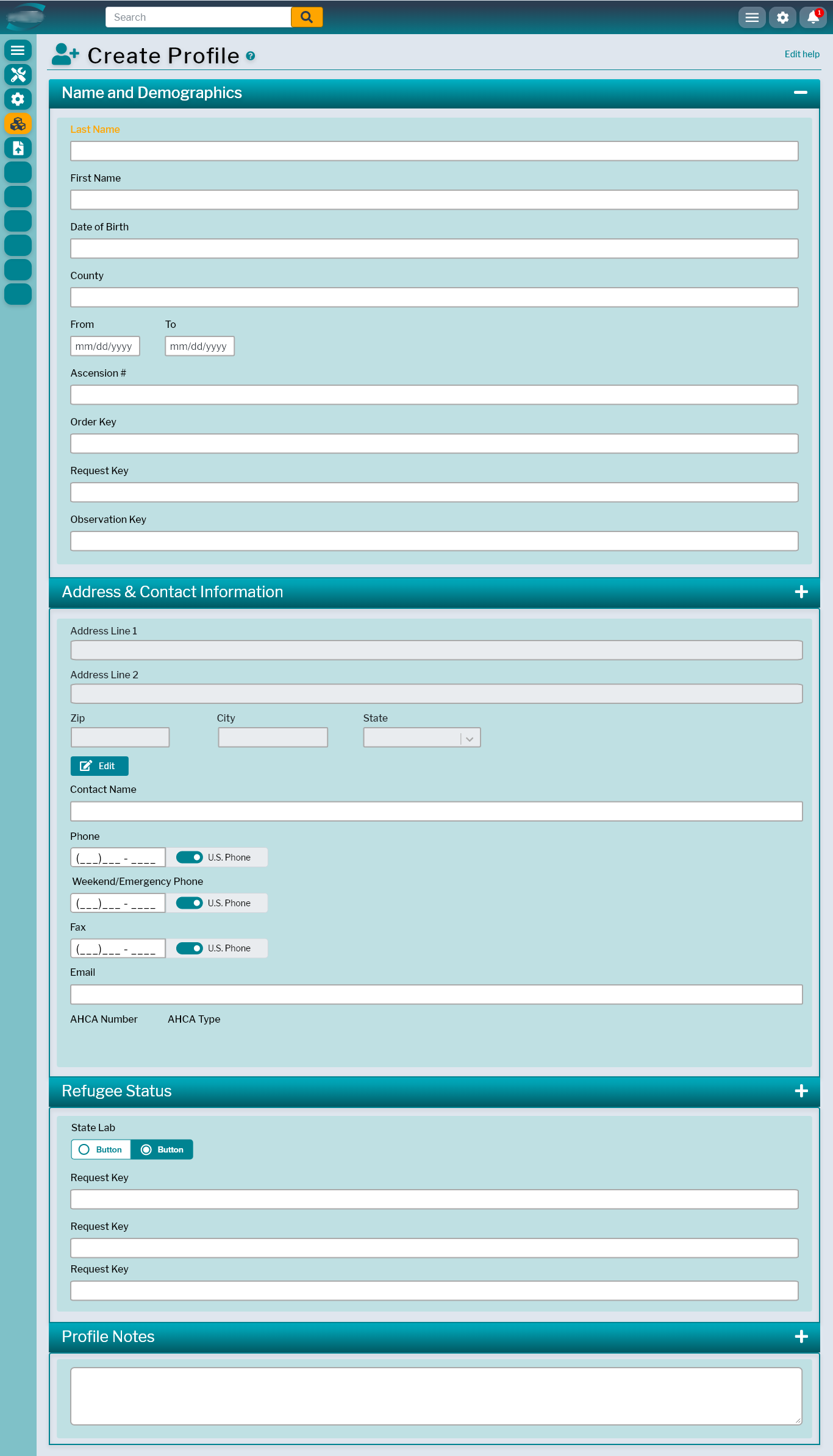
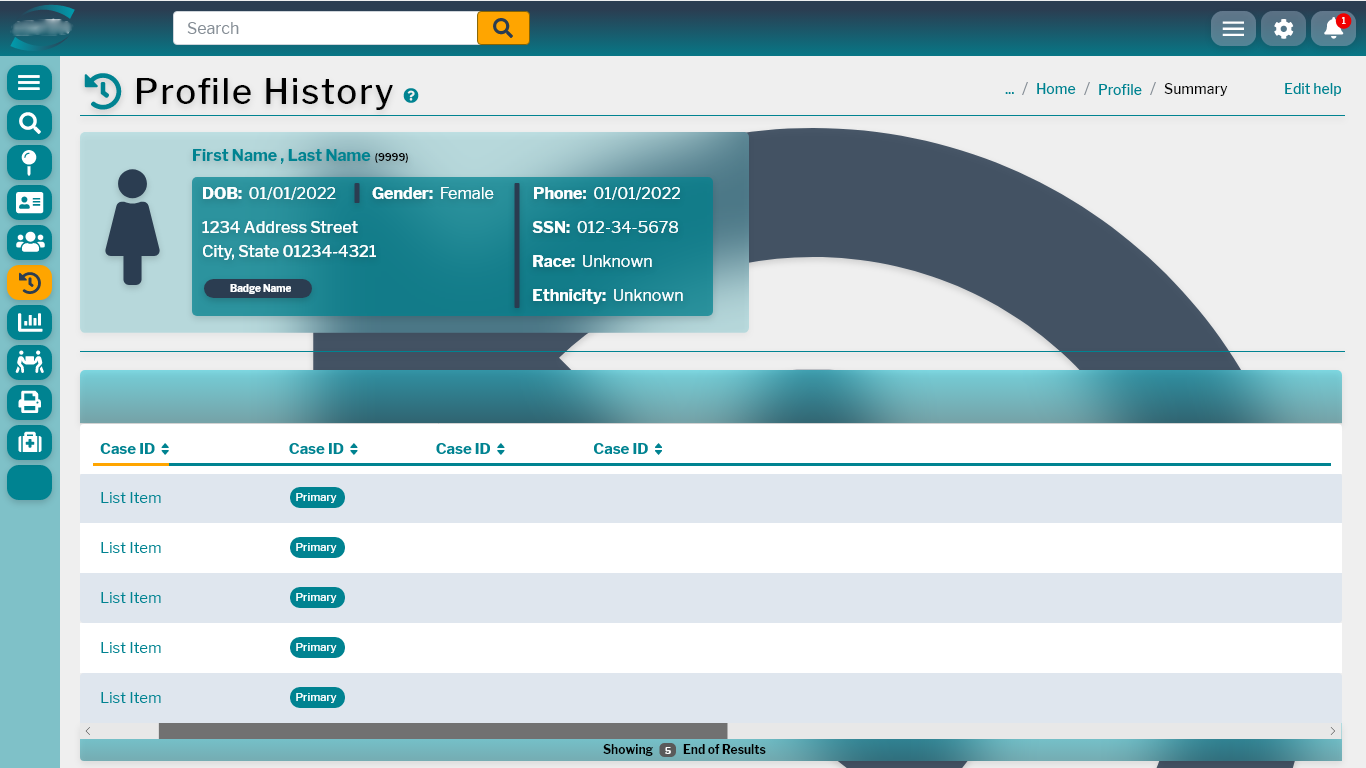
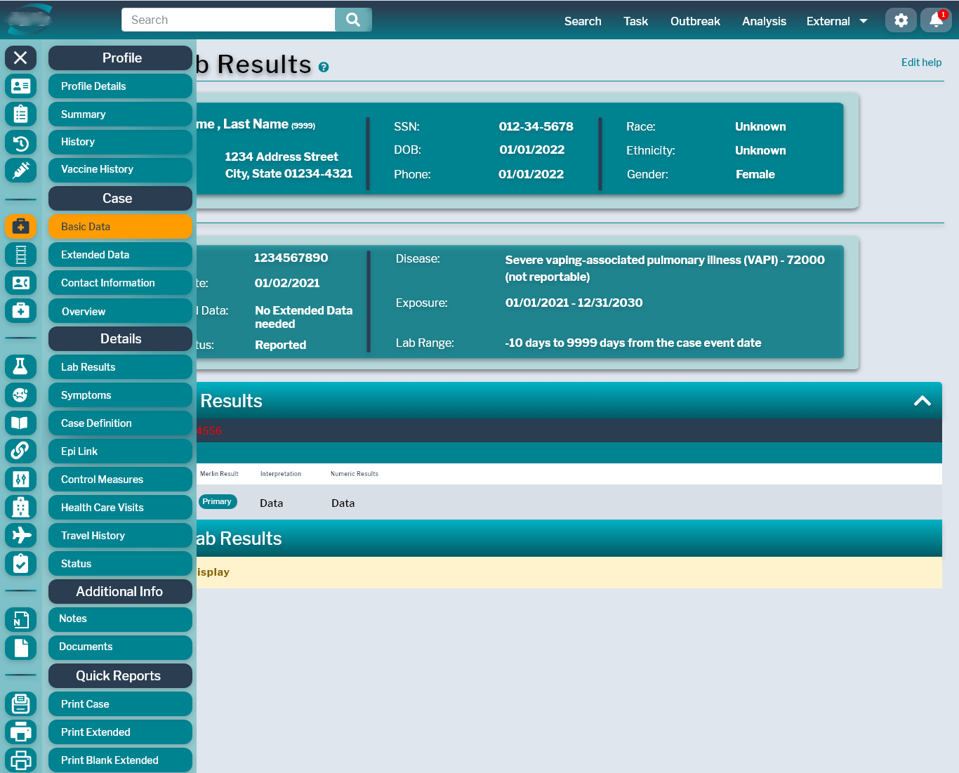
Patient profile data was redesigned from a flat form into a set of layered glassmorphic surfaces — identity, demographics, and case information rendered as progressive disclosure rather than a single dense screen.

HealthCheck — create profile, glassmorphic form
Create profile
HealthCheck — profile history, glassmorphic timeline
Profile history
HealthCheck — case lab results screen
Case lab results
07 — Responsive · Tablet

Built for the field.

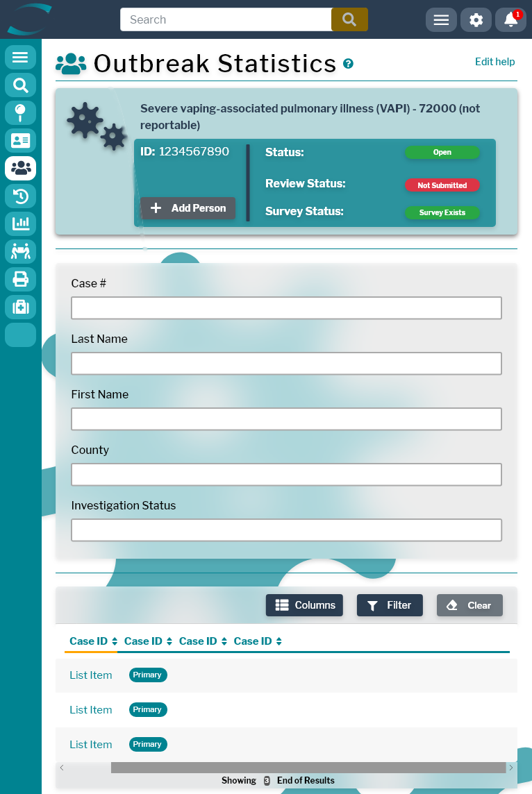
For the first time in HealthCheck's history, the interface followed the investigator. Site visits, outbreak rosters, and lab result triage all worked on tablet — same components, same hierarchy, same hierarchy of decisions.

HealthCheck on iPad — outbreak statistics dashboard
Outbreak statistics — tablet
HealthCheck on iPad — outbreak roster
Outbreak roster — tablet
HealthCheck admin interface on iPad in landscape
08 — Outcomes

What went live.

All
Redesigned screens went live
3
Form factors · web, tablet, mobile
2021–22
Delivered during the pandemic response

Whitepaper · Style Guide v3 · redesigned screens — designed and handed off by me, built by the development team, and reviewed against the designs before going live during the pandemic response.

09 — Reflections

What I'd do differently.

Designing for a high-stakes public-health system during an active pandemic compressed every design lesson into a single, high-pressure engagement. The biggest one: systems before screens. Writing the Style Guide before any individual layout was the call that saved the project. Without a locked color system, type scale, and component library, the work would have fragmented across forty-plus screens and a rotating cast of contributors. A documented system isn't bureaucracy — it's the thing that makes coherence survive the people who build it.

The second lesson was that the audit justifies everything. When stakeholders pushed back on glassmorphism, the UI Trends Whitepaper let me reference documented precedent from comparable healthcare platforms rather than argue from taste. Design decisions land differently when they arrive with a paper trail.

If I were rebuilding HealthCheck today, I'd push the mobile experience even further — closer to a first-class capability than a responsive extension. Field access was a workflow that simply hadn't existed before, and it would have been worth a whole second phase of investment.

HealthCheck — full admin interface on desktop monitor
HealthCheck — the system, held
More Work

Other case studies.

Want to work together?

Always open to conversations about AI experience, product strategy, XR, or art.

Get in Touch