Back to Work

Case Study · Enterprise Agentic Platform · 2022–2025

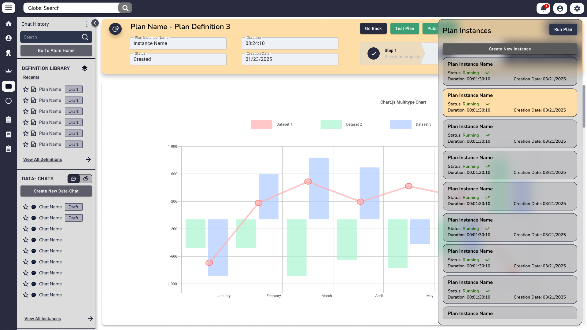
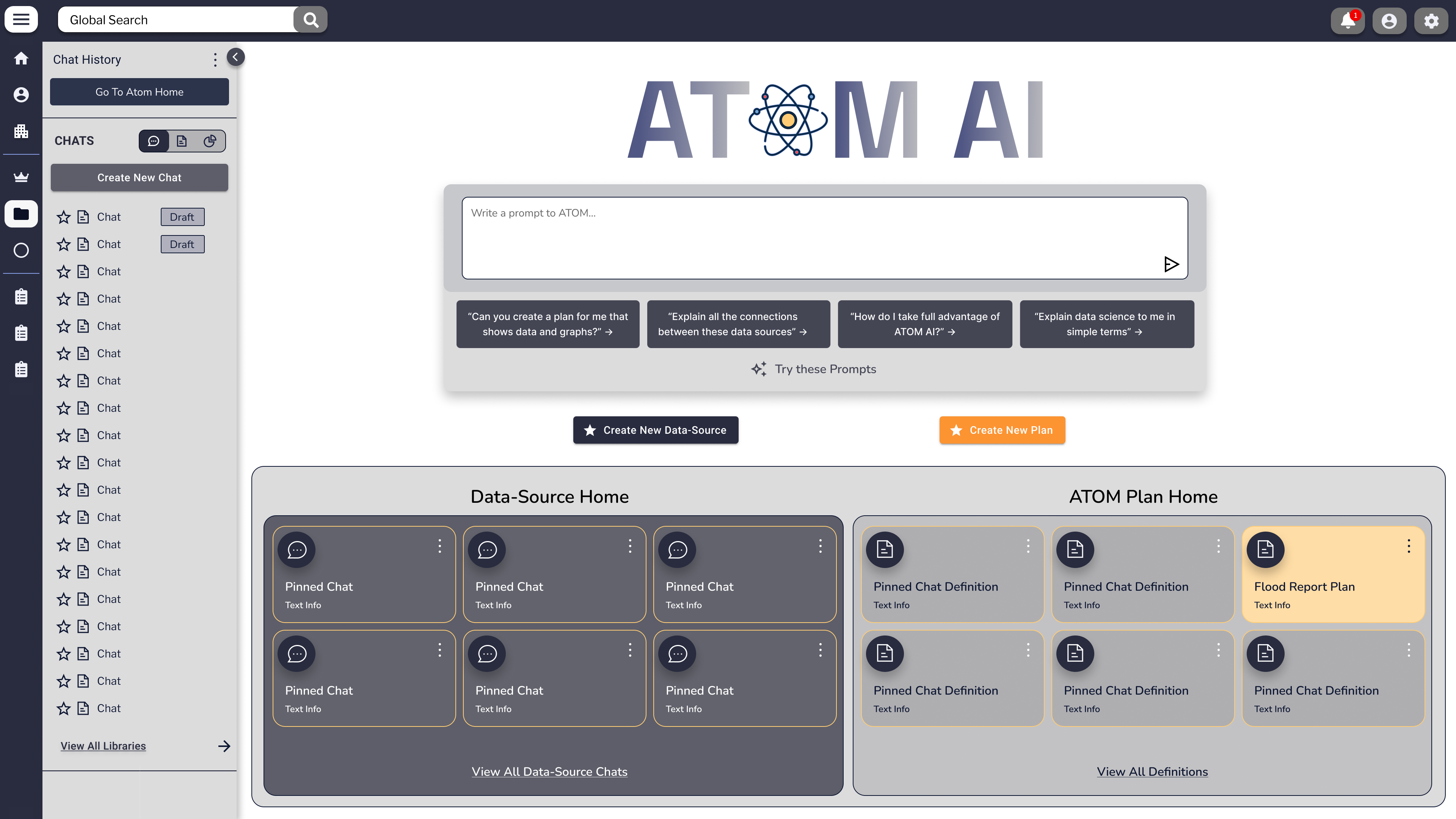
Enfluent Enterprise Agentic Platform · Four Deliverables · Live & Deployed

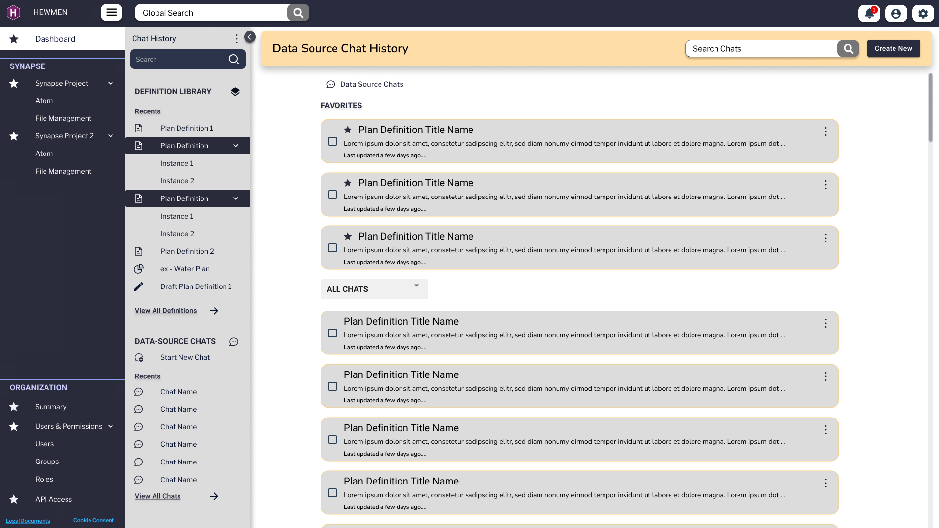
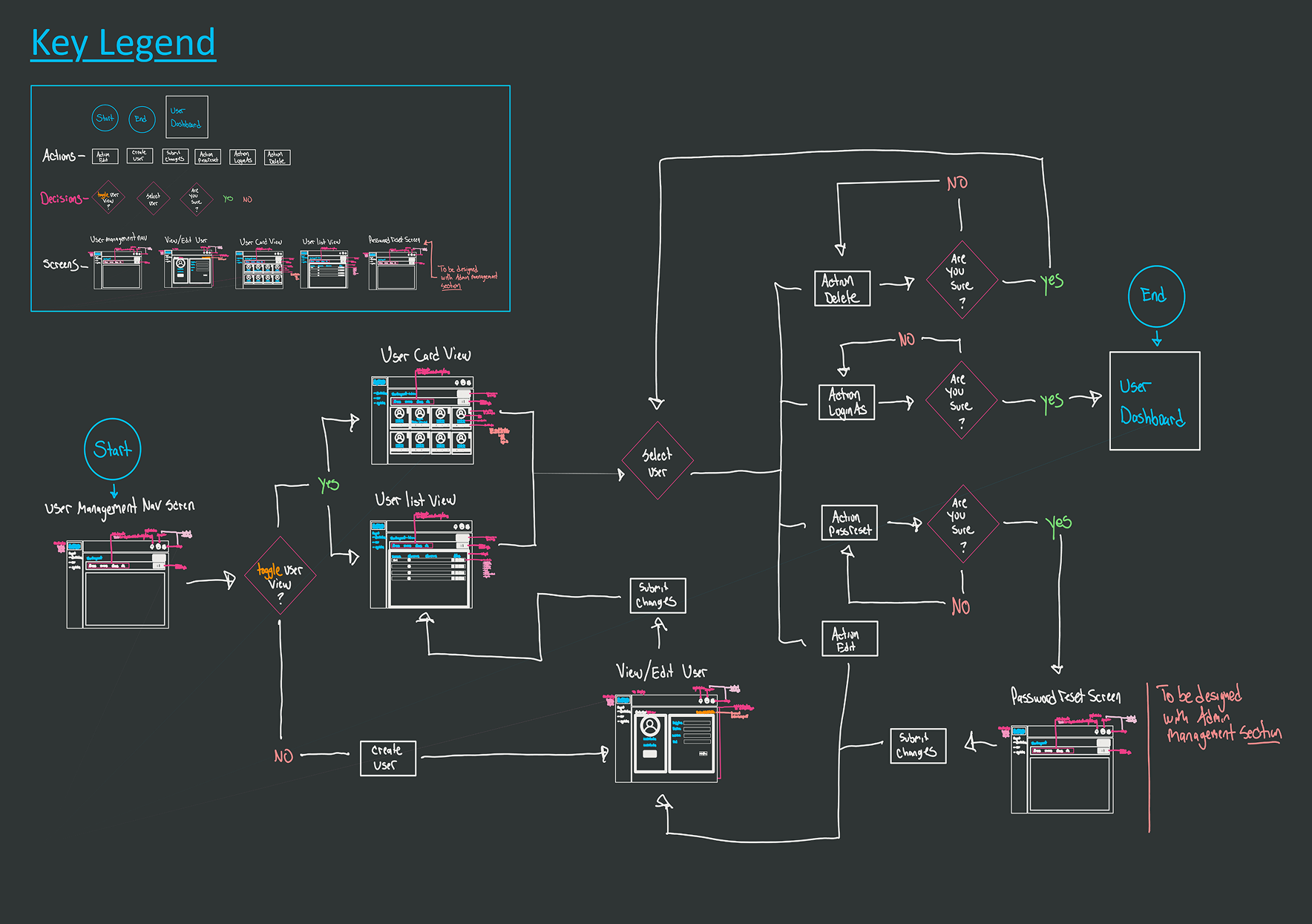
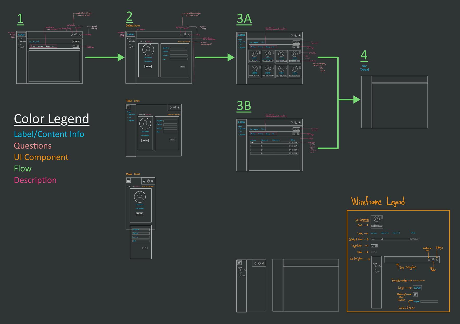
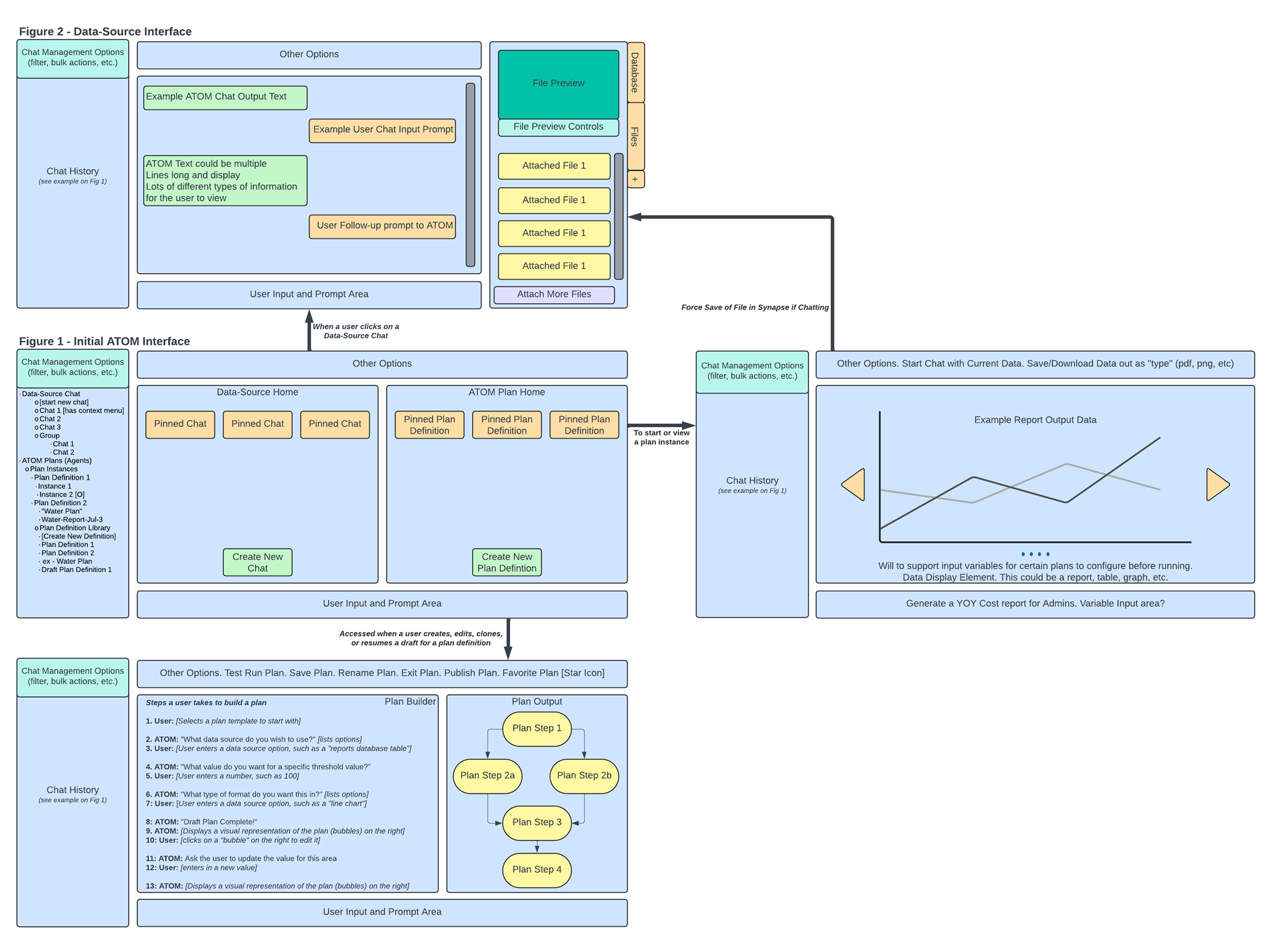
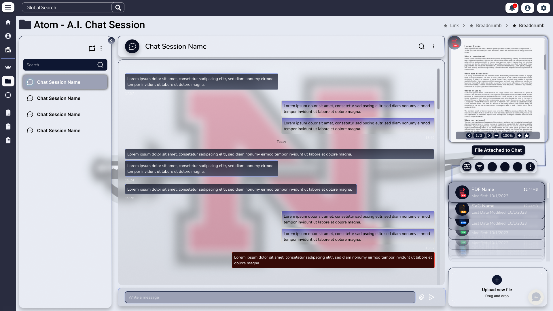
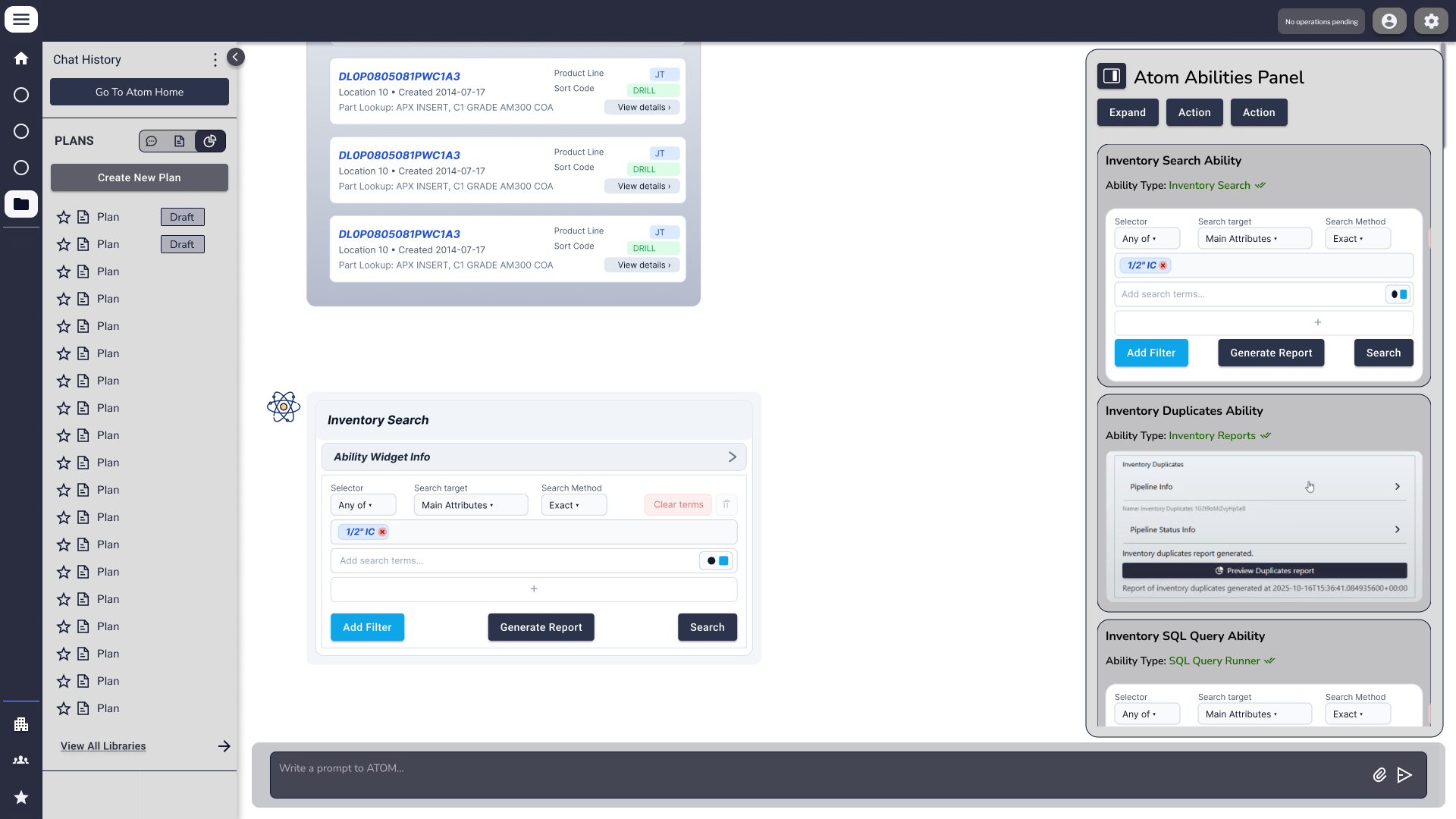
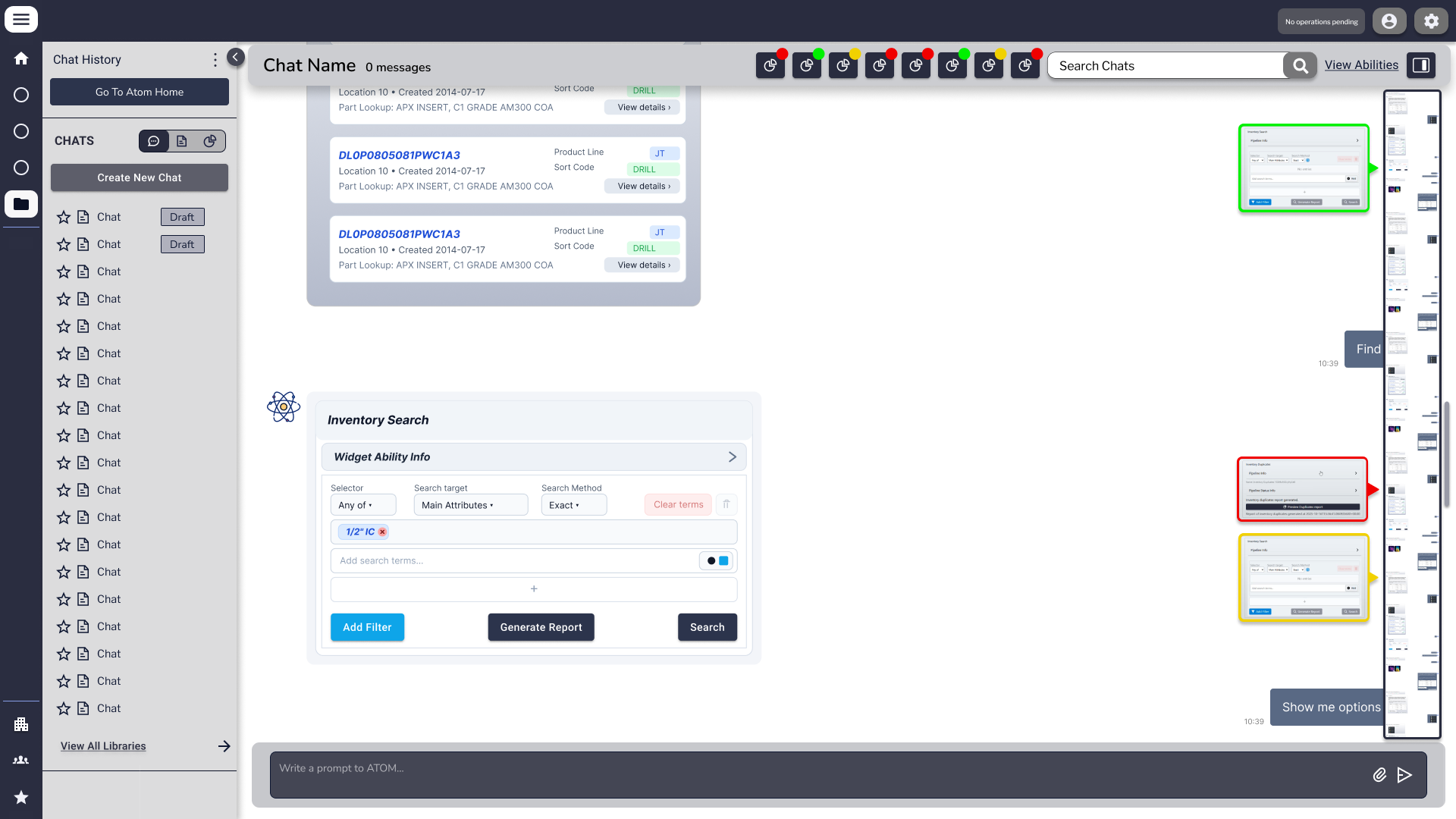
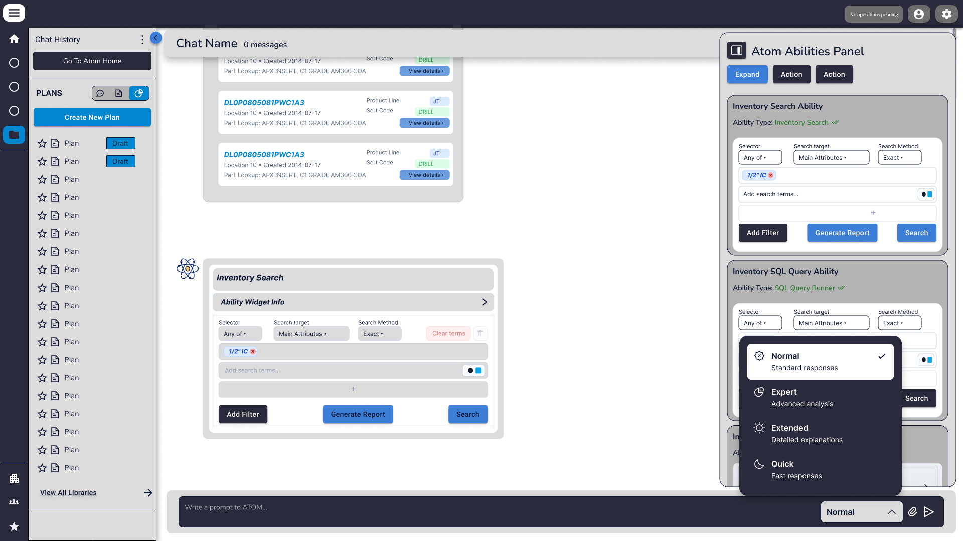
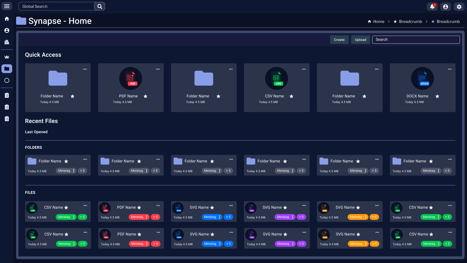
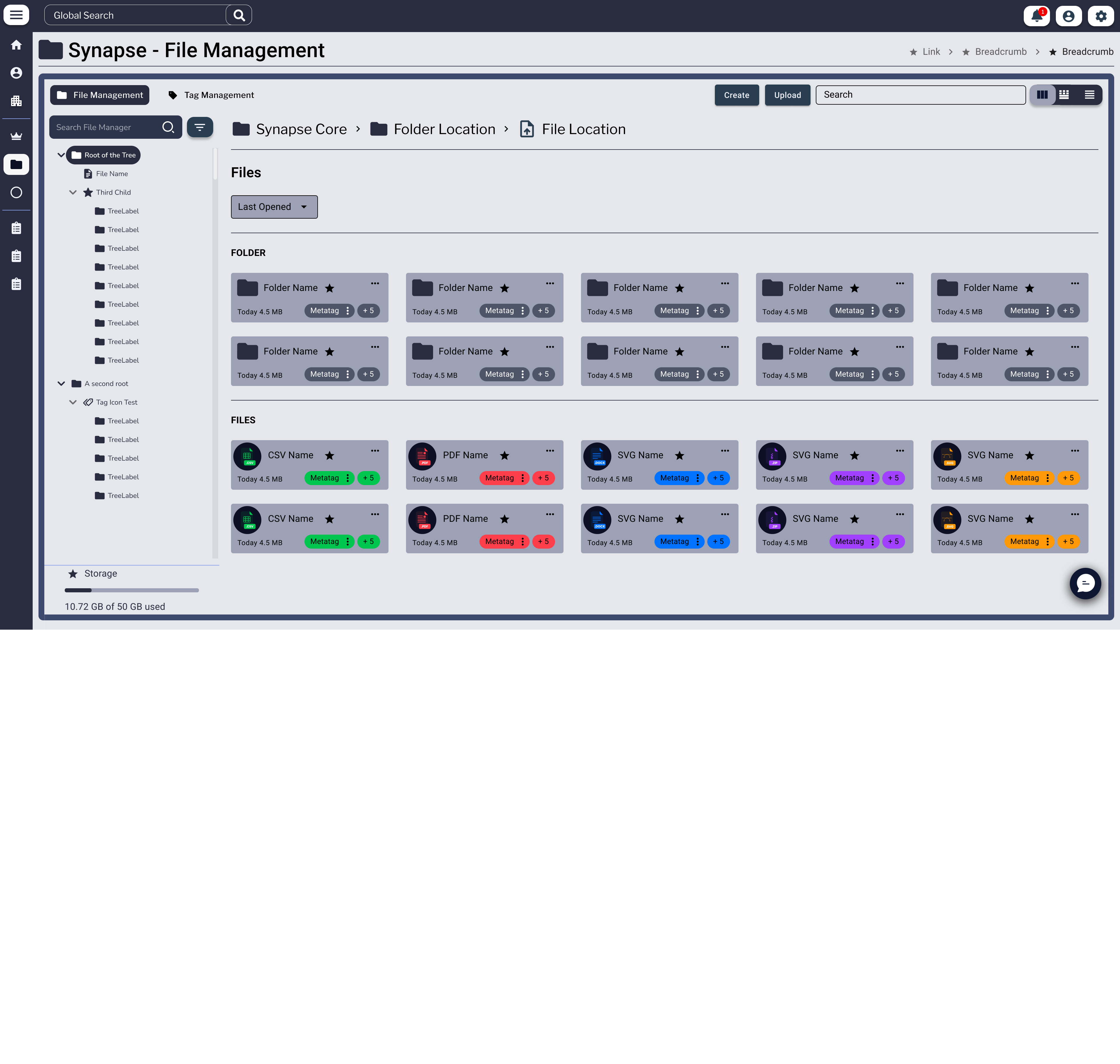
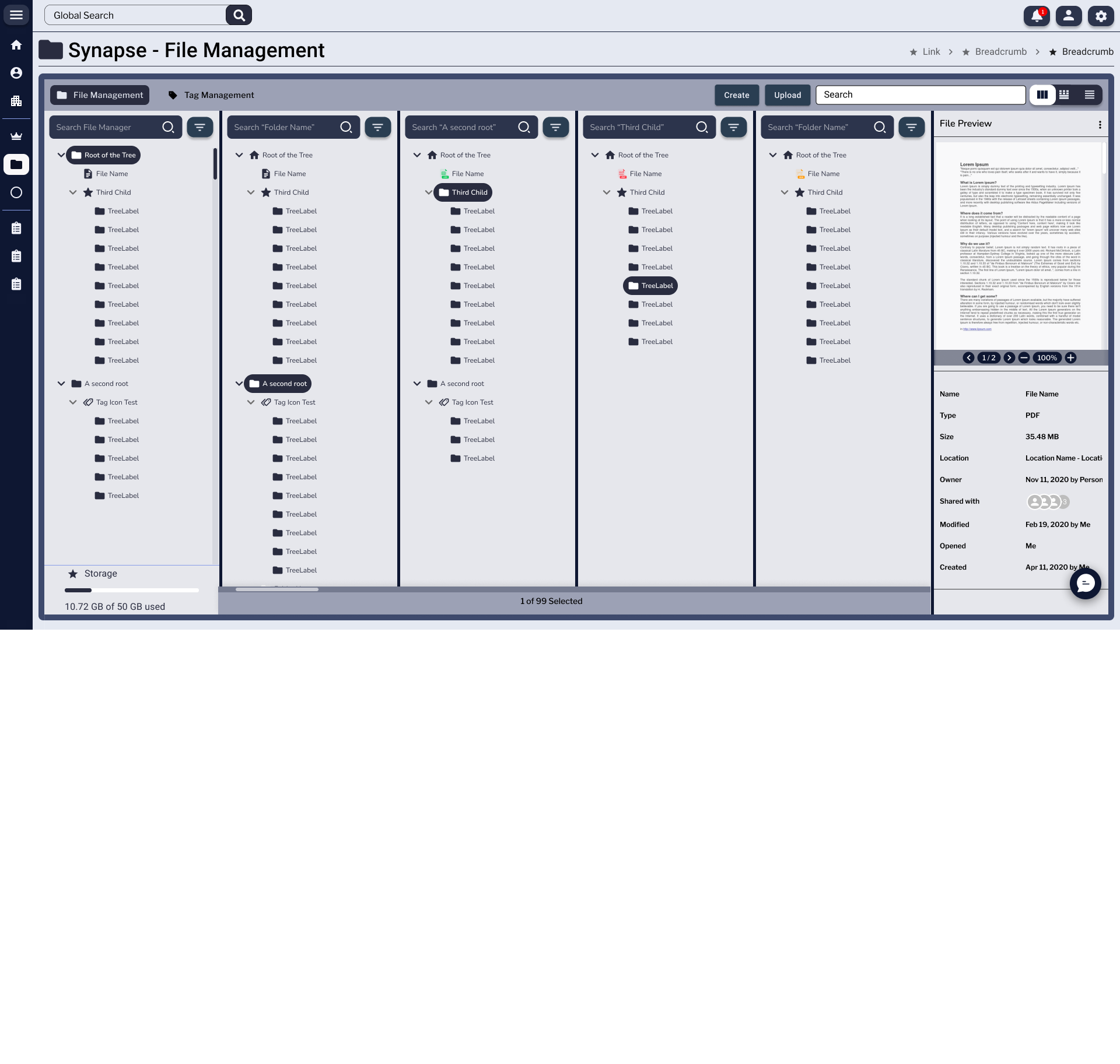
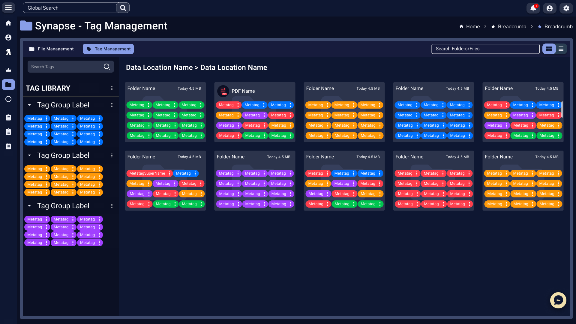
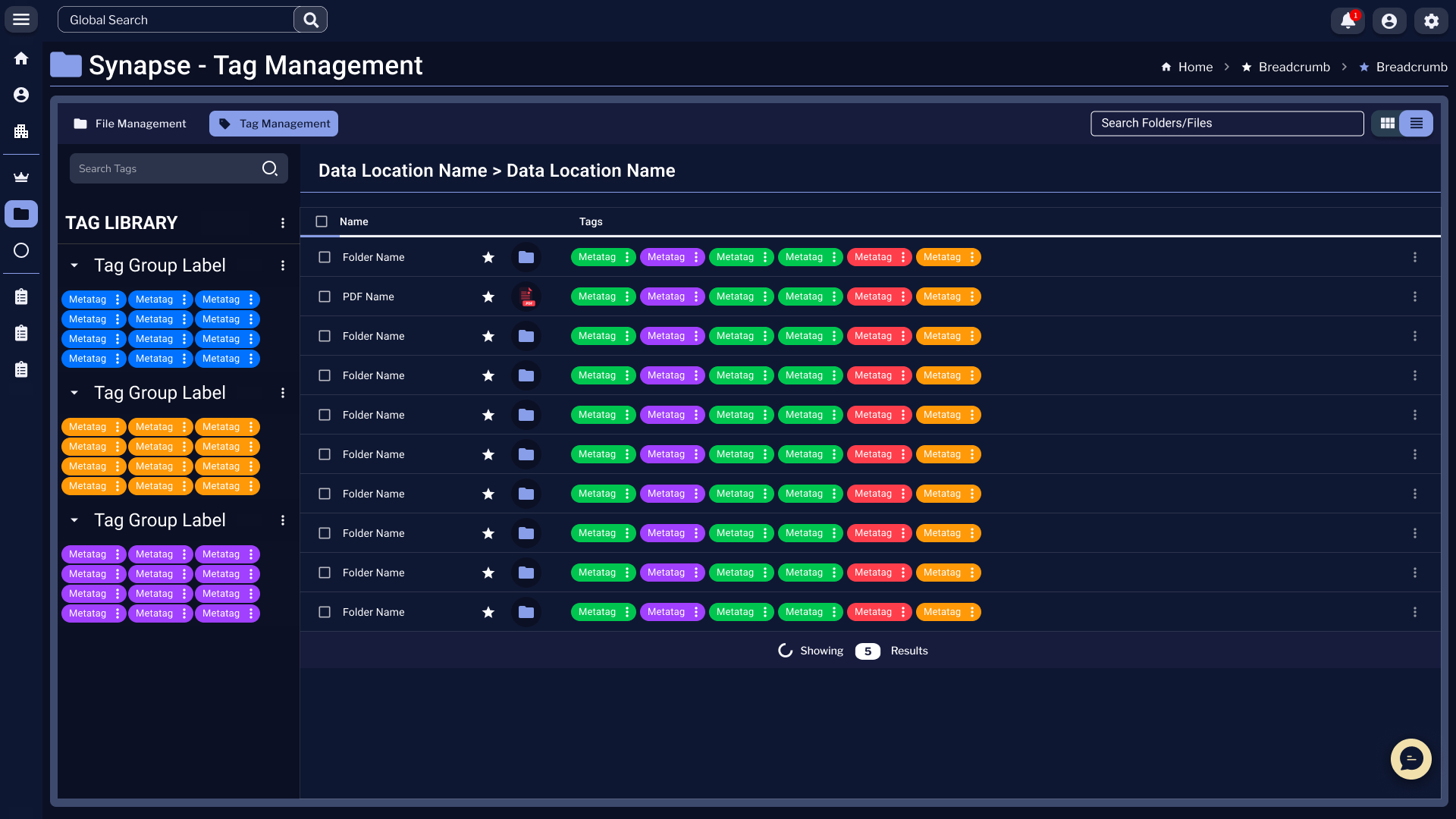
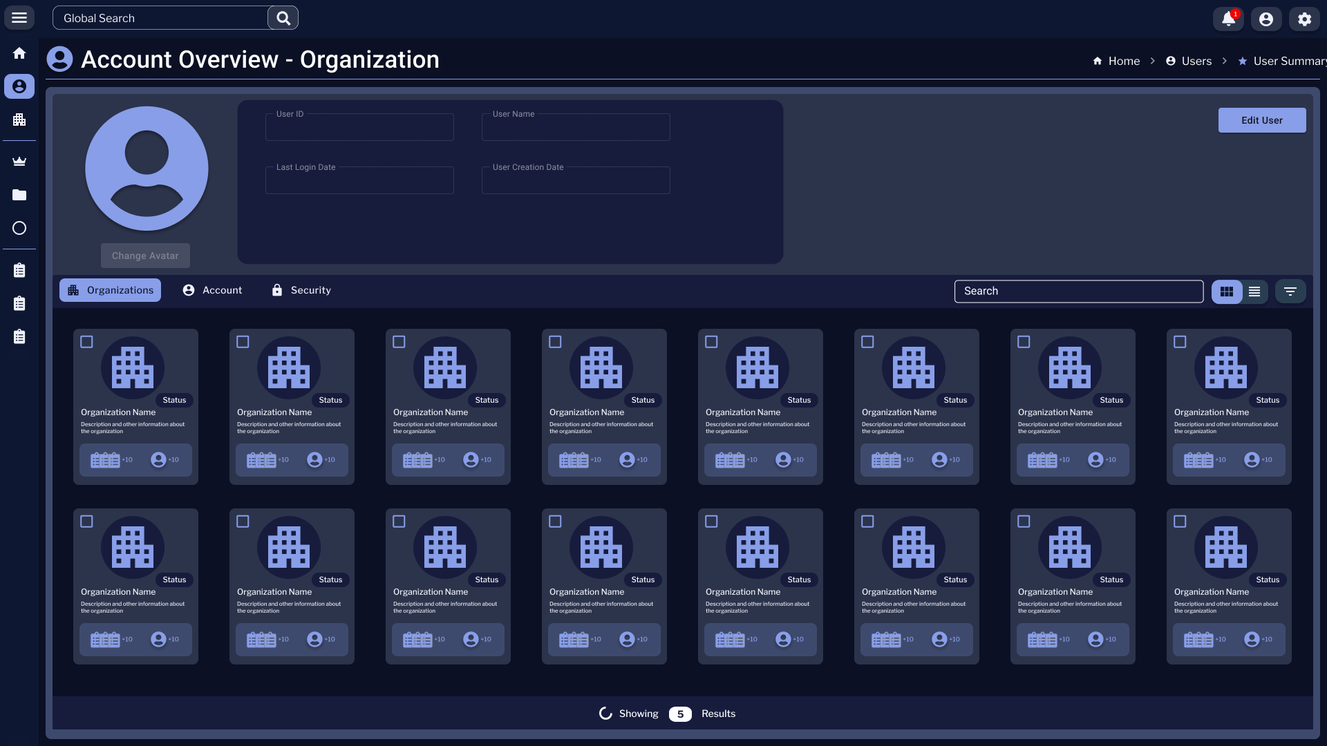
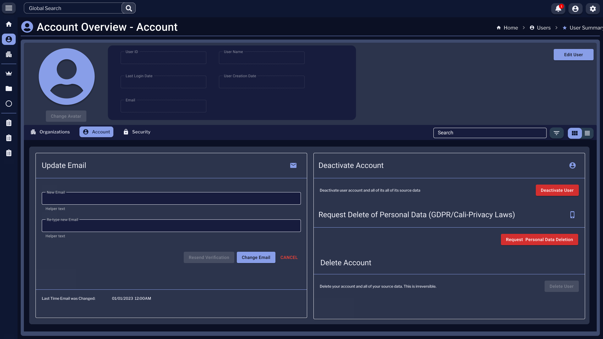
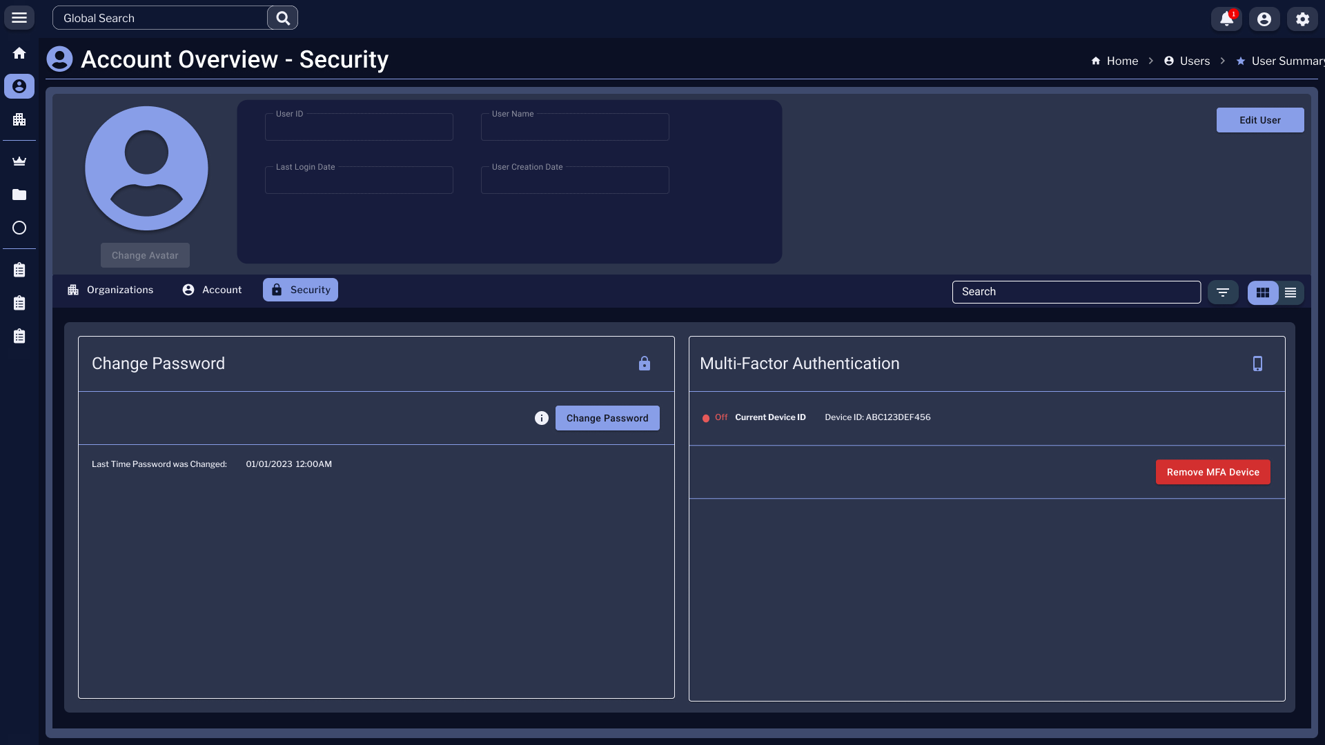
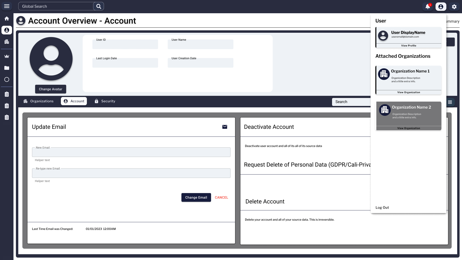
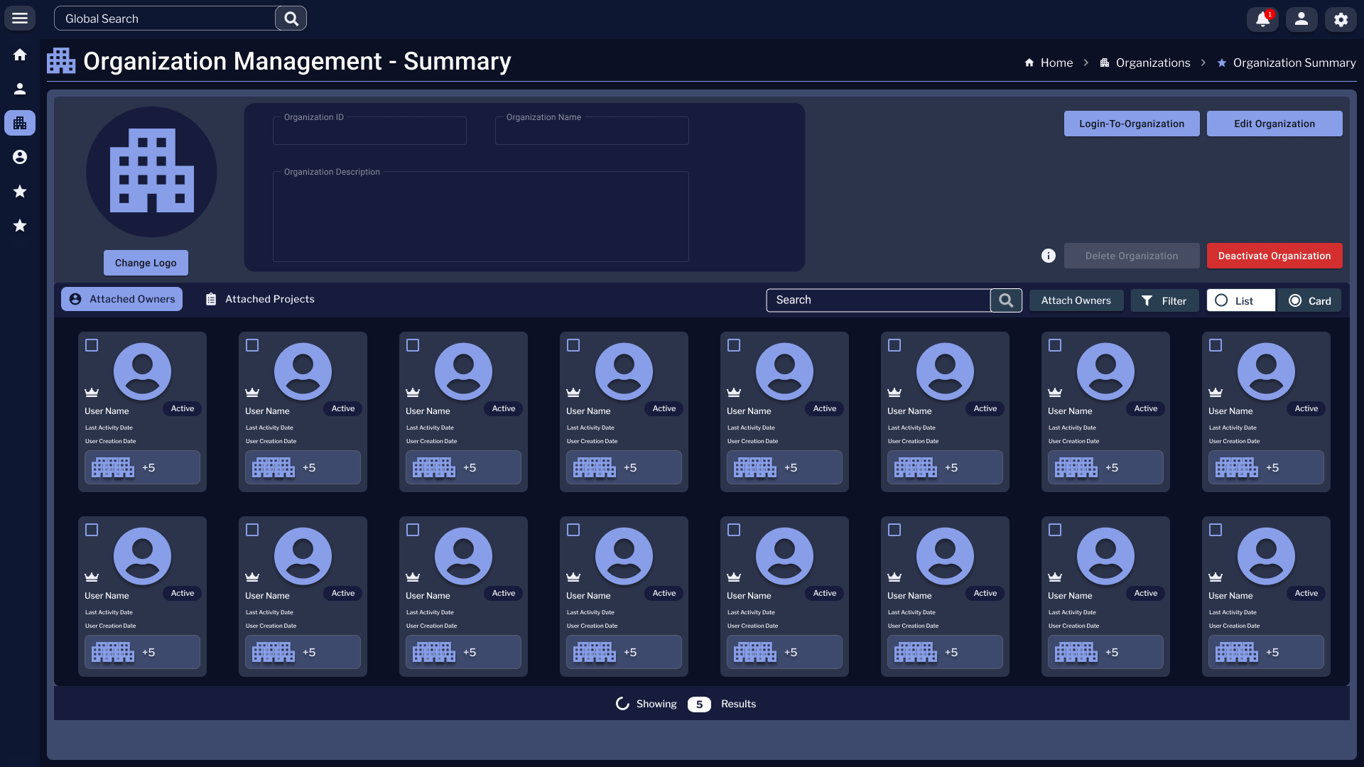
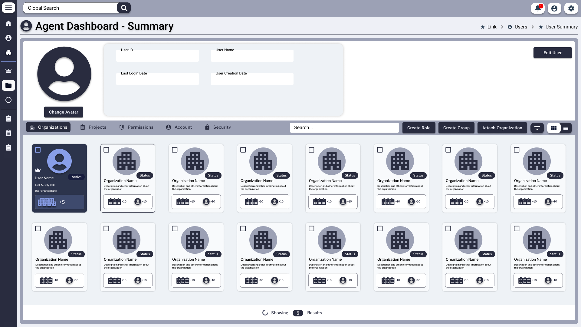
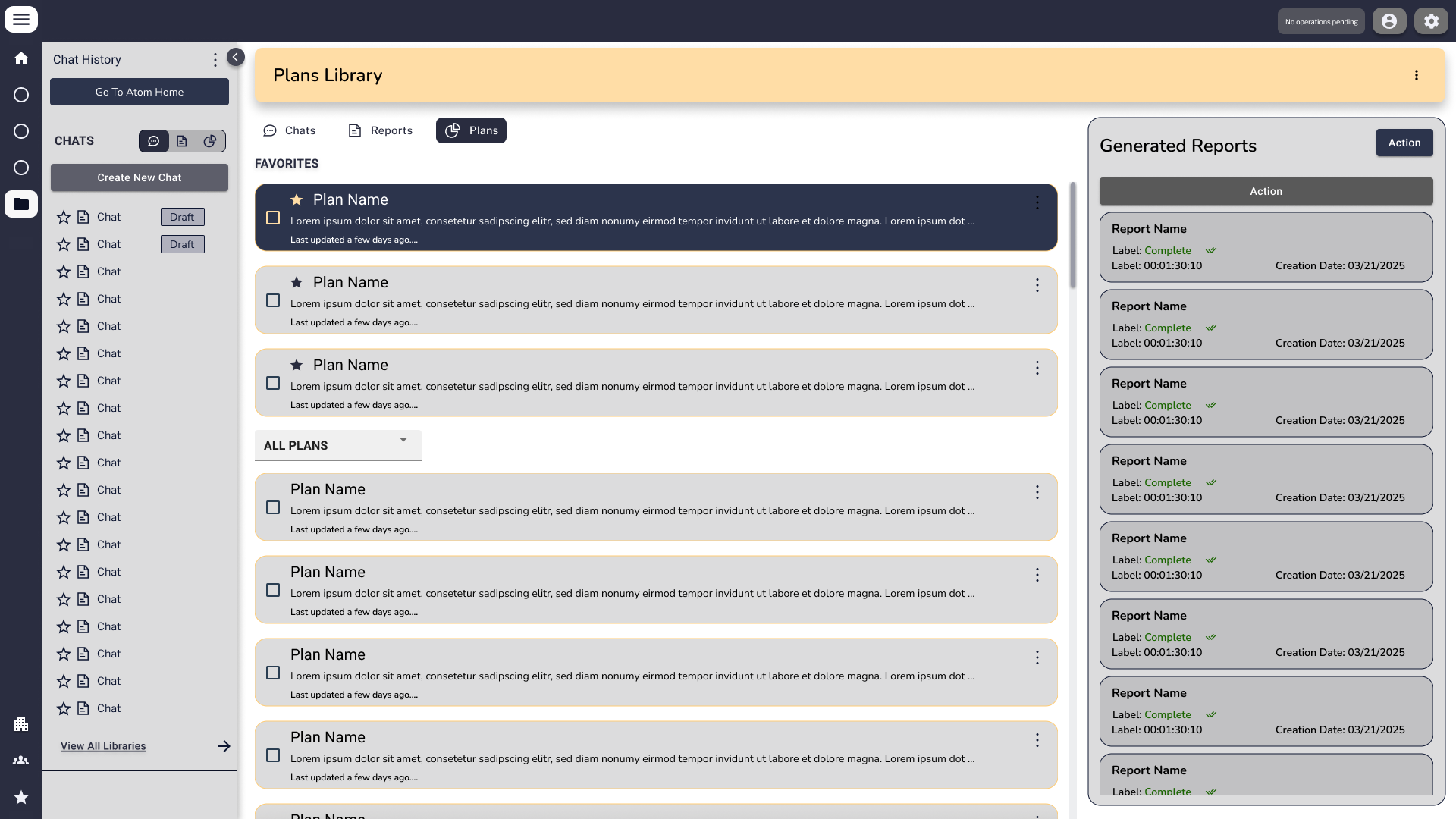
Sole designer across a three-year enterprise agentic platform build — and the marketing website that launched it publicly. I designed Atom (chat interface), Synapse (private knowledge management), and the Enfluent organizational dashboard: application layer, data layer, and orchestration layer. Then I designed enfluent.com — the conversion-focused marketing site that takes the platform to market. One designer. Four deliverables. Built before I had vocabulary for what any of it was.

Agentic Systems UX Human-AI Interaction Application Layer Design Context Architecture Design Systems Svelte · Tailwind · Rust · AWS Live Product · enfluent.com ↗
Role
Sole Designer
Timeline
2022 – Present
Team
Solo
Tools
Figma · Svelte · Tailwind · AWS
Project Type
Enterprise SaaS · Agentic AI Platform · Live & Deployed

3

Years as sole designer

4

Deliverables · 3 surfaces + marketing site

1

Designer · full stack

Live

Deployed at enfluent.com

Enfluent Data Source Chat History page with a left rail listing Definition Library entries, Plan Definitions, Instances, Data-Source Chats and an Organization section. The main panel shows a Favorites group of three Plan Definition cards, then an All Chats group with additional Plan Definition cards underneath.
Data Source · Chat History Where the data layer met the conversation layer. Every chat anchored to a specific data source, every favorited definition reusable across sessions — this is what made institutional memory possible inside the system.

What Enfluent Was

An enterprise agentic platform purpose-built for private organizations — functionally analogous to Claude Desktop or Perplexity's interface layer, deployed on a client's own secure infrastructure with their own private dataset. Three years. Three product surfaces. One designer.

Enterprise organizations needed AI that could work on their own private data — not a public model, not a shared cloud, not a generic chatbot. Their data. Their infrastructure. Their agent — controlled end-to-end.

The Problem It Solved

Enterprise organizations needed AI-powered assistance built on their own private data — not public models with public knowledge. Enfluent gave them an agentic system that lived inside their infrastructure, organized their knowledge, and let employees interact with it through a purpose-designed interface.

My Role

I was the only designer on the product for its entire three-year lifespan. I designed every screen, flow, component, and design system across all three product surfaces — working directly with the CEO, CTO, and Technical Director to translate engineering architecture into interaction design. No design team. No AI tools for the majority of the engagement.

What Made It Hard

The challenge wasn't just design complexity — it was translation. Engineers spoke in system architecture; I had to feel what they were building and render it into something a human could touch. Every major decision required bridging a conceptual gap between how the backend behaved and how a user needed to experience it.

What I Didn't Know Then

I built this before I had vocabulary for what it was. I didn't know terms like "application layer," "context architecture," "orchestration UI," or "retrieval-augmented generation." I was designing all of these things — I just called them by other names. This case study is the retroactive translation.

What Enfluent Does · The Four Capability Pillars

The three product surfaces are the how. These four pillars are the what — the functional capabilities the platform delivers, and the design challenge behind each one.

Pillar 01
Ingest & Unify

Pull data from multiple sources and make it AI-ready. Design challenge: organizations ranged from cloud-native to entirely paper-based. Designing data onboarding meant accounting for OCR upload flows for physical documents — building intake pathways for users who didn't start digital.

Pillar 02
Transform & Clean

Use AI agents, human review, and gamification to make data trustworthy and AI-ready. Design challenge: designing the human-in-the-loop validation layer — combining machine checks with manual review and game mechanics so that data quality felt like participation, not clerical work.

Pillar 03
Query & Report

Let users ask questions about their own data in plain language and receive dynamic reports, charts, and maps. Design challenge: the natural language interface (Atom) had to be learnable by an economist, a parish official, and a field crew worker — with no technical background assumed.

Pillar 04
Automate & Streamline

Trigger AI-driven workflows and deliver proactive alerts across SMS, email, mobile push, printouts, and fax. Design challenge: designing for users who receive AI-generated insights by fax. Outputs had to work for field crews — not just desk workers — which meant rethinking every assumption about what "a notification" looks like.

The Three Surfaces

Enfluent wasn't one product — it was three interconnected surfaces, each corresponding to a distinct layer of the agentic stack. I designed all three.

Atom
Application Layer · Chat Interface

The primary human-AI interaction surface. A tabbed chat interface — the window through which employees directed, reviewed, and collaborated with the agentic system. Designed the conversation flow, tab navigation between active chats, plans view, and reports view.

In agentic stack terms: this is the application layer — the interface that defines inputs and outputs, handles clarification moments, presents agent reasoning, and manages the human-AI handoff. This is what users touched.

Chat UI Plans View Reports View Svelte · Tailwind
Synapse
Data Layer · Knowledge Management

The organization's private knowledge base — a file, folder, and document management system that held the data the agents retrieved context from. Designed the information architecture, navigation, upload flows, tag taxonomy, and access patterns.

In agentic stack terms: this is the data layer — the private RAG-adjacent knowledge store. What gets organized here directly determines what the agent can retrieve and how accurately it responds. Synapse was the library. Atom was the librarian.

File/Folder System Knowledge Base Data Architecture Svelte · Tailwind
Enfluent
Orchestration Layer · Org Dashboard

The top-level organizational management interface — where companies configured structure, managed permissions, set agent boundaries, and oversaw the platform as a whole. Designed for admins and decision-makers, not end users.

In agentic stack terms: this is the orchestration and guard layer — the surface where organizations define what the system does, what it's allowed to do, and who can access what. Context architecture made visible and configurable.

Org Management Permissions UI Admin Dashboard Svelte · Tailwind

Where It Fits in the AI Stack

Mapping Enfluent to the layers described in current agentic platform literature.

Infrastructure Layer
  • Rust backend for performance-critical agent processing
  • AWS cloud deployment — client's own private instance
  • Isolated from public models — client data never leaves their environment
Data + Orchestration Layer
  • Synapse: private organizational knowledge base
  • File/folder structure = context architecture decisions
  • What's stored, how it's labeled, and how it's retrieved — all design decisions
  • Enfluent dashboard: guard rails, permissions, orchestration visibility
Application Layer
  • Atom: chat interface — the human-AI interaction surface
  • Plans and Reports views — structured outputs made navigable
  • Svelte + Tailwind CSS frontend
  • Design system + component library spanning all three surfaces

Where the Thinking Started

Before any polished pixel, the system had to be reasoned out on paper. The earliest artifacts are deliberately low-fidelity — sketched flows, color-coded wireframe progressions, hand-annotated state diagrams. They captured decisions about navigation, permissions, and screen hierarchy long before a single component existed.

Hand-sketched user flow diagram on a dark background, with a Key Legend in the upper-left mapping shapes to actions, decision diamonds branching off a starting state, and small framed wireframes showing the User Card View, User List View, and View/Edit User screens.
Sketch · User Flow

User Management Flow

A full decision-tree for the user management surface — sketched in marker before any UI was built. The legend in the corner is the giveaway: every shape and color carried meaning, so the engineering team could read intent at a glance. Branches handle the "what if no match," "what if duplicate," and "what if needs approval" paths that admin tools always under-design.

Wireframe progression diagram showing five numbered screens — 1, 2, 3A, 3B, 4 — connected with green arrows indicating navigation flow. A Color Legend defines Label/Content Info, Questions, UI Component, Flow, and Description. A small 'Wireframe Legend' panel sits in the lower-right corner.
Wireframe · Progression

Screen-to-Screen Logic

A traversal map: how a user moves between five canonical states (1 → 2 → 3A/3B → 4). Branches at step 3 represented different role-permission outcomes. Color-coding wasn't decorative — it separated label/content from question from flow, so reviewers could comment on the right layer without confusion.

Mapping the System

Between sketches and finished screens sat the architectural work — diagrams that named every entity, traced every permission edge, and made the system legible to a team that included engineers, an executive sponsor, and a single designer. These weren't deliverables, they were thinking surfaces.

Master design architecture diagram on a dark canvas — a dense network of color-coded nodes (purple, orange, blue, green) showing User Roles, Organization, Project hierarchy, User Management, Groups, Permissions, and Roles, with action labels on every connecting edge. A Legend in the upper-right distinguishes Action, User-only, and Work-in-progress nodes.
Master Architecture · Org / User / Permissions

The Entity-and-Action Map

Every screen in the orchestration layer was a slice of this diagram. Nodes are entities (User, Organization, Project, Group, Role, Permission). Edges are actions — and each one had to map cleanly to a UI affordance, an API call, and a permission check. The dense bottom cluster traces the data structure for role + group inheritance, which is the hardest concept to render as interface. This diagram is the reason the admin UI in later sections feels coherent.

Two-panel wireframe titled 'Figure 1 - Initial ATOM Interface' and 'Figure 2 - Data-Source Interface'. The left side shows a chat-history sidebar, data-source home with pinned chats, and an ATOM plan home with plan definitions. The right side shows the data-source interface with file preview, attached files, and a plan builder workflow listing thirteen numbered steps from selecting a template to publishing a plan.
Wireframe · Atom Interface (Figures 1 & 2)

Atom & the Plan Builder, Annotated

A two-figure layout showing the initial Atom shell next to its data-source companion. The right-hand column walks through a thirteen-step "build a plan" sequence — the user's exact path from prompt to published, reusable plan. This is the artifact that taught the engineering team what a "plan" had to be as a first-class object in the system, not just a chat outcome.

Atom — The Chat Surface

The human-AI interaction layer. Every conversation, plan, ability invocation, and follow-up question flowed through Atom. The visual language had to make the agent's intent, confidence, and capabilities legible — without burying the user in chrome.

ATOM AI home screen with a centered hex-atom logotype, a prompt input with example 'Voice Prompts', and two side-by-side panels: Data-Source Home with three pinned chats, and ATOM Plan Home with three pinned plan definitions plus a Flood Report Plan card. Left rail shows Definition Library, Plan Definitions, Instances, and Data-Source Chats.
Atom · Home The landing surface — prompt-forward, with one-click access to pinned data-source chats and saved plan definitions. The "Voice Prompts" row offered example queries to help new users discover what Atom could do.
Atom A.I. Chat Session in full-screen mode. The center panel holds alternating user and agent messages with a watermarked agent monogram behind the conversation. The right rail shows a PDF attachment card with three colored buttons and an Upload-New-File drop zone.
Chat · Full Mode Single-thread focus mode. The watermarked monogram tied the conversation back to the active agent. The right rail kept files-in-context within reach without crowding the message stream.
Chat session with the right-side 'Atom Abilities Panel' open, showing three ability cards: Inventory Search, Inventory Duplicates, and Inventory SQL Query. The center area displays inventory result rows and an Inventory Search filter widget.
Abilities · Expanded Abilities Panel open — surfacing the discrete capabilities the agent could invoke against the user's data. Inline widgets (filters, search, query) replaced text-only prompts with structured input for high-precision tasks.
Same chat session with the abilities panel collapsed to a slim icon strip and a 'Show me options' affordance. A floating preview rail on the right shows three colored thumbnails representing inline results.
Abilities · Collapsed The same surface with the panel collapsed to a thin tab. Density was a deliberate axis — users could go from "full chat" to "full toolkit" with one gesture, without losing context.
Atom chat with an open response-mode dropdown menu showing four options: Normal (standard responses), Expert (advanced analysis), Extended (detailed exploration), and Quick (fast responses). The selector sits at the bottom-right of the input area.
Response Modes Four explicit modes — Normal, Expert, Extended, Quick — let the user set the agent's tradeoff between speed, depth, and cost before sending. This was a confidence-and-cost UX problem dressed as a dropdown.

Synapse — The Knowledge Layer

The private library Atom searched. Every folder structure, every tag, every metadata field was a context-architecture decision — they directly determined what the agent could retrieve and how accurately it answered. Designing Synapse meant designing the conditions for trust.

Synapse Home dashboard with a top-bar Global Search, breadcrumbs reading Home › Breadcrumb › Breadcrumb, and two stacked panels: Quick Access showing six tiles (folders, PDF, CSV, DOCX) and Recent Files split into Folders and Files rows with colorful metatag chips and file-type badges.
Synapse · Home The knowledge layer's landing page. Quick Access pinned the most-touched folders and files; Recent Files surfaced the working set with metatag chips that told the user — and the agent — what each file was about at a glance.
Synapse File Management view with a Folder Tree on the left side (Root of the Tree expanded with nested file nodes), and the main panel showing Folder and Files grids. Breadcrumbs read Synapse Core › Folder Location › File Location.
File Management · Card View Folder tree on the left, content grid on the right. The grid favored recognition over recall — file-type badges and metatag chips meant users could scan rather than read.
File Management in a horizontal multi-column view, with four vertical panels showing different points in the folder hierarchy side by side, and a File Preview panel on the right showing a PDF preview with metadata (Name, Type, Size, Location, Owner, Shared with, Modified, Opened, Created).
File Management · Horizontal A column-cascade view for deep hierarchies — the macOS-Finder pattern adapted to the data layer. The right-side File Preview kept metadata (owner, share state, location) one click away during heavy reorganization work.
Synapse Tag Management view with a left-side Tag Library showing three Tag Group Labels, each with colored tag pills. The main panel displays Folder Name and PDF Name cards in a grid, every card densely populated with overlapping tag chips in multiple colors.
Tag Management · Cards A second navigation mode keyed on tags instead of folders. Files clustered by meaning rather than location — critical for an agent that retrieved by semantic match more often than by path.
Synapse Tag Management in list view, with a checkbox column, file names, and dense rows of colored tag chips per file. A 'Showing N Results' counter sits at the bottom.
Tag Management · List The same tagged content as a sortable, selectable list — for bulk re-tagging and audit workflows. Designing both card and list modes was about respecting the difference between browsing and operating.
Enfluent Data Source Chat History page with a left rail listing Definition Library entries, Plan Definitions, Instances, Data-Source Chats and an Organization section. The main panel shows a Favorites group of three Plan Definition cards, then an All Chats group with additional Plan Definition cards underneath.
Data Source · Chat History Where the data layer met the conversation layer — every chat anchored to a specific data source, every favorited definition reusable across sessions. This is what made institutional memory possible inside the system.

Enfluent — The Orchestration Surface

Where the organization defined what the system was allowed to do. Roles, groups, permissions, organizational structure, identity, and account state — all the boundary work that lets an enterprise trust an agent with their data. Built for admins, not end users.

Account Overview - Organization page with a profile-header band at the top containing avatar, User ID, User Name, Last Login Date, User Creation Date, and an Edit User button. Below sit three tabs — Organizations (active), Account, Security — followed by a 4×8 grid of Organization cards, each with a building icon, name, status badge, description, and small counters for projects and members.
Account · Attached Organizations A single user can belong to many organizations. This grid showed the user-to-org graph as a browsable surface, with each card carrying its own status, headcount, and project counts — the foundation for cross-org navigation.
Account Overview - Account tab. A profile header with avatar and read-only User ID, User Name, Last Login Date, User Creation Date, and Email fields. Below sit two cards: Update Email with New Email and Re-type new Email fields, and a right-side card showing Deactivate Account, Request Delete of Personal Data (GDPR/Cali-Privacy Laws), and Delete Account zones with destructive red buttons.
Account · Profile & Data Rights User-controlled identity surface — including the GDPR/CCPA-aligned data-deletion paths. Destructive actions sat in their own column with intentional friction, so a misclick couldn't end an account.
Account Overview - Security tab with two cards: Change Password (with a Change Password button and a last-changed timestamp), and Multi-Factor Authentication showing an Off status pill, a Current Device ID with device identifier, and a red Remove MFA Device action.
Account · Security Password rotation and MFA state in one frame. Status pills surfaced the security posture without forcing the user to dig — a small but consequential pattern for an enterprise audience.
Account Overview with the user-menu popover open in the top-right. The popover contains User DisplayName, an email line, a View Profile link, and an Attached Organizations list with two organization cards — Organization Name 1 (default) and Organization Name 2 (highlighted as the active context) — plus a Log Out action at the bottom.
Identity · Context Switch The popover where a user switched between attached organizations. The highlighted card signaled which org context was active — every other surface in the system filtered through that choice.
Organization Management - Summary page with an Organization header (logo placeholder, Organization ID, Name, Description), action buttons Login To Organization, Edit Organization, Deactivate Organization. Below two tabs — Attached Owners (active) and Attached Projects — followed by a grid of user-avatar cards listing User Name and Active status badges.
Org Mgmt · Attached Owners The org-side view of the same graph: who owns this organization, what state they're in, and the high-leverage actions (login-as, edit, deactivate) for cross-org admin work.
Agent Dashboard - Summary with a profile-header band containing avatar and User ID, User Name, Last Login Date, User Creation Date fields plus an Edit User button. Below a row of tabs reads Organizations, Projects, Permissions, Account, Security, alongside Create Role, Create Group, and Attach Organization actions. A grid of organization tiles fills the page, each tile with a building icon, name, and status pill.
Agent Dashboard · Org Summary The top-level admin landing — where roles, groups, and organizational structure were created and inspected. The tab strip (Organizations · Projects · Permissions · Account · Security) was the entry point for every governance task in the platform.

enfluent.com — The Marketing Website

After three years designing the product, I designed the site that takes it to market. A conversion-focused public marketing website that translates Enfluent's technical platform architecture into a value proposition for non-technical buyers — small businesses, local governments, and universities.

The Brief

Design a public-facing marketing site that explains what Enfluent is — and converts visitors into demo requests. The product has deep technical architecture; the buyers don't need to understand it. The site had to make the value legible without dumbing down what makes it serious.

Stakeholder Direction

Designed under direct direction of the CEO, CTO, and Technical Director. Three stakeholders with three distinct priorities — product vision, technical accuracy, and market positioning — all held in a single coherent design.

Design Objectives

Clear visual hierarchy from the first scroll. Minimal navigation to keep attention on the value proposition. "Request a Demo" as the primary CTA threaded throughout every major section. Visual language consistent with the product — dark navy, magenta accents — so buyers who became users landed somewhere familiar.

Two Audiences, One Designer

The marketing site speaks to Enfluent's buyers — small businesses, local governments, and universities. The product surfaces speak to their users. Designing both required holding two audiences in mind simultaneously: what the buyer needs to believe, and what the user needs to do.

View the Live Product

Enfluent is live, deployed, and in active use. The marketing site is the public face of three years of platform design work.

Visit enfluent.com ↗

Conversion-focused structure — "Request a Demo" CTA threaded across every major section, with a hierarchy designed to earn the click before asking for it.

Non-technical buyer language — complex AI platform architecture translated into plain, credible value propositions for buyers without in-house AI expertise.

Brand-consistent visual system — dark navy and magenta palette carried from the product surfaces into the marketing site so the two feel like one company, not two separate agencies.

Plans & Reports

An agentic platform is only as trustworthy as its reasoning is visible. Plans captured what the agent intended to do; reports captured what it actually did. Together they turned an opaque process into something a non-technical stakeholder could inspect, save, and rerun.

Plans Library page with a left rail of Chats and a tabbed central content area (Chats, Reports, Plans). The Plans tab is active, showing a Favorites group of three Plan Name cards and an All Plans group below. A right-side Generated Reports rail lists six report cards, each with Status, Date, and Action metadata.
Plans Library Plans as first-class, savable, sharable objects. The right rail tracked every generated report so a user could walk back from any output to the plan that produced it — full traceability without leaving the surface.
Plan Instance Viewer titled 'Plan Name - Plan Definition 3' with metadata fields (Instance Name, Created date, Status Step 1) and Go Back, Test Plan, Publish action buttons. The center area renders a multi-layer chart combining bar histograms in pastel red and green with an overlaid line graph and data points along months January through May. A right-side Plan Instances rail lists six running instance cards with Status Running and timestamps.
Plan Instance · Viewer An executing plan in flight — chart output rendered inline, status visible per instance, with the option to Test, Publish, or step back through the definition. This is where "the agent did a thing" became "the agent did this specific thing, here's the evidence."

What the Work Actually Was

The hard problems weren't visual — they were conceptual. Designing interfaces for systems that don't behave the same way twice requires a different kind of UX thinking.

Core Challenge
Designing for a System You Can't Fully Predict

Traditional UX designs for deterministic systems — the button does the same thing every time. Agentic systems don't. Designing Atom meant creating interfaces that remained trustworthy and clear when the agent was confident, uncertain, partially right, or completely wrong. The human-AI handoff moments, the confidence signals, the "I can't do this — here's what I can do" patterns — these were not engineering decisions. They were design decisions. I made them without knowing they had names.

Design Reality

Traditional UX assumes a button does the same thing every time. I was designing for a system that doesn't. Every interaction pattern I knew had to be rebuilt from first principles — not around states, but around confidence levels, reasoning visibility, and graceful failure.

Challenge 01
Context Architecture as Information Design

Synapse wasn't just a file manager. How it was organized determined what the agent could find, how fast, and how accurately. Every folder structure decision, every naming convention discussion, every access pattern — these were context architecture decisions. I was designing the library the agents searched. I just didn't call it that.

Challenge 02
Sole Designer Across a Three-Surface Platform

Three distinct user types — end users in Atom, knowledge managers in Synapse, admins in Enfluent — with different mental models, permissions, and task flows. One designer. One design system that had to hold all three surfaces in coherence without becoming generic.

Challenge 03
Translating Architecture into Experience

Every major design decision required a translation step: the engineers described system behavior in architectural terms, I had to render it as lived experience. Without a technical co-designer, this translation happened through direct dialogue with the CTO — absorbing the system, then working back to the human surface.

Challenge 04
Designing for Non-Technical Users at Every Stage of Digital Maturity

Enfluent's users weren't engineers or IT staff — they were economists at a university, staff at a parish government office, field crews at an environmental agency. Some organizations didn't have unified digital data at all; some were still paper-based. Designing a platform that met each of them where they were — from cloud-native to fax-dependent — required rethinking every assumption about what a user brings to the interface.

Challenge 05
Human-in-the-Loop Gamification for Data Quality

One of the platform's core capabilities is using gamification to make data validation engaging for non-technical staff. Designing this meant reconciling two things that rarely sit together: the playfulness of game mechanics and the seriousness of government or healthcare data. The UI had to make "check this field" feel like participation, not clerical work.

What I Brought

  • Holistic systems thinking — sensing the whole before the parts
  • Pattern detection across complex, ambiguous information
  • Product judgment: does this work for a real person?
  • Direct translation between engineering and experience

What I Delivered

  • Full design system across 3 product surfaces
  • Chat interface with plans and reports navigation
  • Private knowledge management system
  • Organizational dashboard and permissions UI

What It Proves

  • Designed the full application stack of an enterprise agentic platform — application layer, data layer, orchestration layer
  • Designed the product's public marketing website — stakeholder-directed, conversion-focused, brand-consistent
  • Designed for non-technical users at every stage of digital maturity — from cloud-native to paper-based
  • Worked directly with CEO, CTO, and Technical Director across a three-year engagement
  • Held design coherence across four deliverables and two distinct audiences — product users and marketing buyers
  • Translated system architecture into human experience — without a design team, design manager, or AI design tools

What I Called It Then / What It's Called Now

The work didn't change. The language did. This table maps the design decisions I made to the technical vocabulary that describes them — so hiring managers and engineers know exactly what I built.

What I Designed How I Described It Then The Technical Term Why It Matters
Atom chat interface The main user interface — where you talk to the system, see your work, manage outputs Application Layer / Human-AI Interaction Surface The interface layer that defines all inputs, outputs, and handoff moments
Synapse file system The document and knowledge management side — where you store and organize company files Data Layer / Context Architecture / RAG-adjacent Knowledge Base Organization here determines what the agent can retrieve and how accurately it responds
Enfluent dashboard Admin and org management — who has access, what the system does, company structure Orchestration & Guard Layer Defines agent permissions, boundaries, and workflow coordination
Plans and Reports views The tabs where you see what the agent has done and is planning to do Agent Reasoning Output / Structured Output Presentation Makes agent planning and execution legible to humans — critical for trust
Handoff / escalation design When the AI can't do something, where does it send the user? Human-AI Escalation Patterns / Graceful Degradation UX The hardest UX problem in agentic systems — failing without destroying trust
Cross-surface design system Making sure all three parts of the product look and work consistently Multi-Surface Agentic Platform Design System Coherence across agent surfaces is rare — most platforms have 3 separate feeling products
Private deployment architecture The client has their own version — their data stays in their system On-Premise / Private Cloud Agentic Deployment Security-first enterprise AI — the fastest growing segment of the market
The gamification layer Making data cleanup more engaging for non-technical staff Human-in-the-Loop Validation / Crowdsourced AI Quality Scales data quality beyond what pure AI can guarantee — humans catch what models miss
The marketing website The public website that explains what Enfluent is and gets people to request a demo Conversion-Focused Product Marketing Design Shows ability to translate complex AI architecture into accessible buyer-facing language

Why This Matters for
What I'm Building Next

Most designers are learning agentic UI from the outside — taking courses, reading documentation, building toy projects. I spent three years building it from the inside, without the vocabulary, which means the intuitions are deeper than the terminology.

I'm not transitioning into AI design. I'm translating what I've already been doing into the language the field now uses to describe it.

01

Sole designer of an enterprise agentic platform — not a feature, not a component, not a prototype. A three-surface production product with real organizational users.

02

Designed the full stack UX — application layer, data layer, and orchestration layer. Each surface required different design thinking. All three required coherence.

03

C-suite to code — worked directly with CEO, CTO, and Technical Director to translate architecture into experience. The role required being the only human bridge between engineering and the user.

04

Pre-AI tooling, pure process — the majority of this work was completed before AI design tools existed. Every decision was made through direct cognitive process, research, and iteration.

In Production · Deployed to Real Clients

Enfluent is live at enfluent.com and deployed to clients across higher education, local government, and environmental resilience.

View the Live Product

The public marketing site and the platform are both live. This isn't a prototype or a speculative case study — it's shipped work, in use, with named institutional clients.

Visit enfluent.com ↗

What This Project Was

"That's not a transition.
That's an evolution that happened in the work itself."

When I started on Enfluent, I was a Technical UI/UX Designer. By the time the marketing website launched, I was something the field didn't have a clean title for yet: an AI Experience Designer. I hadn't taken a course. I hadn't read the papers. I had designed the human-facing layer of an agentic platform from the inside — the chat interface, the knowledge architecture, the permission system, and the public site that explained all of it to the world.

That's not a transition. That's an evolution that happened in the work itself.

08 · Reflections

What I'd do differently.

Three years in, the honest answer is that I'd start the evaluation framework earlier. When you're the only designer on an agentic platform, the temptation is to ship the interface and trust the engineers' word that the system is "working." I learned — slowly — that knowing when an AI output is actually right is its own design surface, and it should have been baked in from the first sprint rather than retrofitted at the end. The hardest decisions I made on Enfluent weren't about components — they were about what to show users when confidence is ambiguous, and I made most of those calls without any real evaluation data to lean on.

The org dashboard's permission system is the part I'd simplify most. In the current architecture, role-based access is enforced at the display layer — the UI just doesn't render controls a user can't use. That worked fine at small scale, but as the team expanded into multi-organization deployments, the invisibility became confusing rather than clean. I'd rebuild that surface with explicit permission states: show the control, grey it out, explain why. Hiding capability entirely felt elegant at the time. It turned out to be a form of obscurity that created more support overhead than the visual clutter would have.

The marketing site was sequenced wrong. We built it in parallel with the platform, which meant the story we were telling publicly kept diverging from what the product could actually do. I'd pull that work until the platform's core loop was stable — two or three months later than we started it. A design portfolio piece that accurately represents a shipped product is worth more than a polished pitch that outpaces the reality. That lesson applies here too: what you see in this case study is the platform as it exists now, not the version I originally imagined.

09 · Continue

Other case studies.

Want to work together?

Open for senior design + AI work. Reply within 24h.